Design, UI, UX, Insights, Web Development
eCommerce Trends 2026 & The UX Shifts You Need to Watch For
-
- December 19th, 2025

The eCommerce trends 2026 show how shopper habits are shifting and which UX updates actually move the needle. You’ll get practical insight into personalization, AI-driven support, and more.
As 2026 gets closer, you’re facing a real shift in how people shop online. Users expect clean layouts, quick paths to the right product, and pages that react to what they actually want, which is in contrast to the static templates that treat every visitor the same. And because shoppers move between mobile and desktop without patience for friction (or significant attention span), your UX is now directly tied to whether someone buys or bounces.
Today, we’ll walk you through the most important eCommerce trends 2026 with practical ideas you can apply right away. You’ll see what the online store UX looks like in 2026 and the tech that’s already shaping how people discover and evaluate products.
Trend #1: Human personalization
In 2026, your store adapts to real behavior in the moment, so customers feel like the experience is designed for them specifically.

Why does this matter?
Because people reward relevance. When someone lands on your homepage and immediately sees categories they’ve explored before or a bundle that actually solves their problem, you’ve earned a moment of trust. And in eCommerce, moments of trust equal purchases.
Use cases you can apply:
- Dynamic homepages that reshuffle featured categories based on what someone viewed last week.
- Bundles that adjust to a shopper’s style, price comfort, or depth in a category.
- Smart search that remembers previous filters so the customer doesn’t have to repeat steps.
How this works on Shopify and other eCommerce CMS platforms?
Behind the scenes, Shopify’s AI recommendation tools read patterns: past orders, browsing depth, items added (or removed) from the cart, and even how long someone lingers on certain product types. You simply configure sections like “Recommended for you” or “Inspired by items you viewed”.
As shoppers interact, the algorithm reshapes what they see, which means that instead of throwing random products into a carousel, your store highlights items that match current intent.
For example, if someone keeps checking wide-leg pants, your homepage can automatically promote matching tops or similar fits from other brands.
Impact on revenue
Relevant suggestions almost always lift average order value. Visitors come back because your store feels intuitive and supportive. This is the eCommerce equivalent of a store associate remembering your taste.
Stats:
About three out of four shoppers get annoyed when sites don’t feel relevant. That’s why so many brands are leaning on AI-and seeing big jumps in revenue along the way. (Craftberry)
Personalization also helps people find stuff faster. Nearly 60% of shoppers say it makes browsing easier, and plenty of online stores see more sales after adding it. (Fast Simon)
Trend #2: AI-driven shopping assistants
AI is now stepping into the role of an on-page shopping companion. Instead of sending users through endless menus, you let them ask questions directly, exactly like they would with a store associate.

What the assistant can actually do?
Your AI assistant handles all those micro-decisions that slow people down:
- “Will this fit me?”
- “Is there a matching accessory under $30?”
- “What’s the difference between these two models?”
- “Do you have something similar in black?”
If someone asks for a gift under $50, the assistant instantly filters the entire catalog and presents a tight list of options that fit the brief.
Where this helps the most?
- Visual search. A customer uploads a photo, and the assistant finds similar products in your store.
- Conversational queries. Users type naturally “I need hiking shoes for wet trails” and the system interprets intent.
- Instant clarity. Fit, materials, restocks, compatibility, shipping timelines (and users won’t have to dig through your FAQs).
How does this reduce decision fatigue?
There are tiny barriers that push people away such as too many filters, unclear sizing, long comparison hunts. Here, your AI assistant removes that cognitive load and shoppers can reach the right product in fewer steps.
For example, a user lands on your online store to browse for jackets. Instead of jumping between product pages, they ask “Which one is warmest but still lightweight?”, and the assistant scans descriptions, reviews, and attributes, then gives a direct recommendation.
Impact on revenue
When your users make decisions easier, checkout happens faster, and respectively, abandoned carts often drop.
Stats:
Shoppers who use AI chat are way more likely to buy-about four times more, in fact, and they check out almost twice as fast. Returning customers also tend to spend more when help is right there. (Anchor Group)
Nearly 8 in 10 companies use AI, and about half of online stores use it to improve the shopping experience. (Net Guru)
Trend #3: One-page checkout is the new standard
When it comes to losing customers, nothing does it faster than a clunky checkout. This is why a one-page flow keeps everything in front of the shopper at once, so you reduce hesitation and guide them toward finishing the purchase.

Why long flows cause trouble?
If you’ve ever clicked through three or four checkout screens, you start wondering why the store needs all this information, or whether the process will drag on. Every extra tap adds friction, and users abandon the cart the moment the flow feels tedious or confusing.
How does a one-page layout fixe real problems?
- Wallet-first buttons (Shop Pay, Apple Pay, Google Pay) fill in most data automatically, so you’re removing form fields instead of adding them.
- Helpful microcopy gives quick reassurance-things like “We’ll only use your phone number for delivery updates.”
- A tiny progress hint (“You’re almost done”) keeps the user confident that the finish line is close.
Stats:
One-page checkouts tend to convert better, about a 7% lift on average, and in some cases way more compared to clunky multi-step checkouts. (DigiSmoothie)
Most shoppers still abandon their carts, but simpler one-page checkouts help keep people moving instead of dropping off. (Made by Shape)
Trend #4: Motion micro-interactions that clarify actions
Any subtle but meaningful motion tells your customers what works without forcing them to read extra text. For example, when someone taps a tiny button on mobile, they want instant confirmation. Consider adding micro-interactions like a quick pulse on a button or a tiny icon flick to prove that the action landed. This will reduce uncertainty and help users move forward with confidence.

Practical cues you can add
- Add-to-cart pulse like a very short bounce or glow to confirm the item actually made it into the cart.
- Wishlist spark like a half-second shimmer after tapping the heart icon.
- Hover-to-reveal image hints, such as a quick shift between angles or textures to help users understand what the product feels like in real life.
Where does this work especially well?
Activewear stores often highlight the chosen size for a brief moment, reducing the risk of mis-clicks on small buttons. Beauty brands flick shade swatches to show that the color is locked in. Moments like these keep shoppers from second-guessing and backtracking-two behaviors that often kill conversions.
Trend #5: Adaptive layouts for multimodal shopping
Shoppers are using more voice, AR, foldable displays, and even subtle gestures. This means that your layouts now need to adapt to the way each user interacts, instead of assuming everyone follows the same old path.
Why does it matter?
- Voice input cuts the time it takes to jump from “I need a new winter jacket” to an actual set of products.
- AR previews help people understand scale and fit inside their own space, which reduces uncertainty.
- Foldable screens shift between narrow and wide layouts instantly, and your store needs to respond without breaking the design.
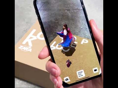
For example, big furniture brands already place AR previews directly on product cards. You only need to tap once, hold your phone up, and you’ll instantly see the sofa sitting in your actual room. When shoppers can visualize the product at home, they also make decisions faster, and returns drop because expectations match reality.
Trend #6: Social commerce UX patterns
Social platforms have become full shopping channels, which means your store needs to feel at home inside TikTok-, Instagram-, Facebook-, and YouTube-style experiences. Your audience scrolls fast, trusts creators more than brands, and expects a one-tap jump from content to checkout.
In-app checkout and creator-led flows
On TikTok and Instagram, shoppers can now complete a purchase without ever visiting your actual site. Your product might appear in a 10-second clip, a creator’s outfit breakdown, or a live unboxing. If you adapt your store to match that flow, you make it easier for customers to connect the dots.
Think of elements like:
- “Shop the creator’s board” layouts where someone can explore a full outfit or tech kit in a single panel.
- Short vertical videos embedded on PDPs so the product feels native to the way shoppers discovered it.
How your store syncs with social formats?
- Vertical video product pages give mobile visitors instant context-how it moves, how it looks in real hands, how big it really is.
- Swipe-based galleries let users flick through style variations and real-life angles the same way they scroll through feeds.
- Quick-view panels surface the essential info (price, color, materials) without forcing a full page load.
For example, beauty brands now nail this pattern. When a creator posts a vertical shade test, the viewers can tap the tag, and the PDP loads inside the app with the same vertical rhythm. If they have their saved wallets ready, the checkout will take seconds. Consider that when your own store mirrors that feel, especially on mobile, you can support that “I saw it, I want it” moment.
Stats:
AI-powered recommendations are expected to drive a big chunk of future online sales, up to a 59% boost. (Shopify)
New tech that’s worth your attention
Every year brings new tools that quietly change UX. When you adopt the right ones, your team ships more content, updates layouts faster, and supports conversions without adding manual busywork.
One clear shift to watch is Shopify’s move toward Agentic Commerce. Instead of isolated features, your store starts acting on intent automatically. Systems observe behavior, make decisions, and trigger changes on their own, whether that’s reordering homepage sections, adjusting recommendations, or guiding shoppers toward the next best action without waiting for manual rules.

You’ll already see this show up through :
- Generative product imagery that lets you test new angles, seasonal colorways, or lifestyle shots without booking a full shoot.
- AI-driven homepage updates that reorganize sections based on what visitors do today, not what you guessed last month.
- Micro-segmentation logic that places users into small intent-based groups and adjusts suggestions accordingly.
- Smart autofill that remembers size history, color preference, or previous order details to speed up checkout.
As a short example, let’s say a footwear brand recently rolled out size recall for returning customers. When someone comes back, their usual size is already selected. This removes one more reason to abandon the cart.
Practical design tips for your 2026 store
Some upgrades pay off immediately, while others compound over time and build lasting UX quality.
What to improve first?
Most Shopify (and other eCommerce platforms- based) stores see the biggest lift when they sharpen product discovery. You can often raise conversions simply by tightening filters, cleaning up your PDP layout, and speeding up checkout before touching deeper design changes.
Quick UX wins:
- Replace long paragraphs with short, clear product points that answer the questions customers care about most.
- Reorder your PDP images so size, scale, or fit appears earlier in the gallery.
- Add wallet buttons right at the start of checkout to remove unnecessary steps.
Long-term UX wins:
- Structured content models give your team control over collections, categories, and seasonal updates-without rebuilding layouts.
- A one-page checkout with confident microcopy reduces drop-off for every visitor.
- Smart recommendations that create smoother paths for repeat shoppers, which will help them rediscover products that fit their taste and intent.
Bonus pro tip (it’s a secret 🤫):

FAQ about eCommerce trends 2026
What’s the next big thing in eCommerce UX?
The biggest shift you’ll feel is how AI starts guiding your shoppers in real time. Instead of forcing visitors to dig through menus, your store begins meeting them halfway-showing the right items before they even start searching.
Product pages also adjust their content based on subtle cues, like what’s already in the cart, how deep the session is, or whether the shopper typically sticks to a certain price range.
And checkout also becomes noticeably smoother when the system remembers past sizes, preferred payment methods, and delivery habits.
How can I make personalization feel natural on my store?
Let behavior build what shoppers see. Personalization starts to feel intuitive when your homepage reshuffles itself based on what someone explored last time, when your bundles adjust to a customer’s style or budget, and also when search remembers recent filters and serves up more relevant results.
What’s the best way to implement AI shopping assistants?
Place your assistant right on your product pages so it can answer questions the moment hesitation appears. Shoppers should be able to ask things like “Will this fit me?” or “What’s the difference between these two?” without leaving the page. You can also offer visual search, where someone uploads a photo and instantly sees similar items from your catalog.
Why should I switch to a one-page checkout?
Because every extra step is a chance to lose someone. A single-page checkout keeps all details visible and manageable at once. Pair it with wallet-first options like Shop Pay, Apple Pay, or Google Pay, and add short, friendly microcopy to reassure shoppers.
How do motion micro-interactions improve UX?
Subtle motion acts like instant feedback, especially on mobile where it’s easy to question whether a tap actually registered. For example, use a quick pulse when something is added to the cart, a brief spark when someone taps the wish list icon, or a fast image shift that reveals texture or color to make the interface feel responsive.
What does adaptive layout for multimodal shopping look like?
Adaptive layout means your store adjusts to the different ways shoppers interact, whether they’re using voice commands, AR previews, or foldable screens. Voice search might jump them directly into the right category, while AR lets them place a product in their real space to understand scale and style.
Meanwhile, a foldable phone might switch from a tall format to a wide one mid-session, and your layout should expand smoothly without breaking.
How can I sync my store design with social commerce trends?
You can do it by bringing the feeling of TikTok and Instagram straight into your product pages. For example, use vertical videos to recreate the discovery moment someone had on social or a swipe-style galleries to mirror how users already navigate content on their feeds. Consider also supporting in-app checkout for shoppers to buy directly from creator posts or clips.
Before you go, don’t forget to check out our other awesome UI/UX design articles! We’ve got loads of tips and inspiration to help you create awesome designs.