Design, UI, UX, Insights, Inspiration
eCommerce Homepage Best Practices [with Examples]
Peak user experience starts from the homepage. Let’s look at the eCommerce homepage best practices and give you live examples for each.
-
- September 20th, 2022

Just like with a physical store, the homepage of your eCommerce website is your storefront. If visitors find it overcrowded, disorganized, or not welcoming, they would inevitably leave. This is why it’s crucial for your online store to have optimized product pages, intuitive navigation, and a smooth checkout experience. Peak user experience, however, starts from the homepage. In this blog post, we’ll take a look at the eCommerce homepage best practices and give you live examples for each.
To start with, your Homepage design should be able to immediately tell your visitors who you are, and what you offer, and give them a convincing reason to stay, shop, and complete the checkout process.
To do so, any eCommerce homepage has the following key elements:
- Brand identity – The homepage should make your brand recognizable and different.
- Value proposition – Your unique value proposition(UVP) differentiates you from your competitors. Explain what makes your services special.
- Sales and specials – Feature your current deals and specials prominently on the homepage.
- Navigation – Your navigation should help your visitors intuitively find what they need, but also lead them toward conversion.
- Search bar – Especially for eCommerce stores with more products and services, the search bar is one of the most important elements that improve user experience and conversion rates.
- CTA – Clear and prominent Call-To-Action(CTA) buttons compel visitors to make a quick decision and complete the action you wish them to.
- Easily accessible shopping cart – A shopping cart is a sticky element that is accessible at all times.
- Contact info – Location and phone number reinforce your business’s legitimacy and build trust.
Now, after we know the crucial elements, we can start exploring the 8 best practices for a successful eCommerce homepage + useful tips to follow.
eCommerce Homepage Best Practices: Overview
1. Display Your Unique Value Proposition
Your unique value proposition(UVP) is what tells visitors why they should choose your business instead of hundreds of other brands that offer the same or similar services.
In terms of your eCommerce marketing, that proposition is a short, sweet and compelling story that you spread throughout your homepage, as well as your entire website.
Let’s look at some tips for making an effective UVP presentation.
Tip 1: Make sure your UVP is obvious and clear
Avoid using abstract language. For example, state that you “create engaging websites that help businesses build a memorable brand” instead of “create experiences and solve challenges”. What are the experiences and what are the challenges? Who knows?
Popcornopolis, for example, is on point with what they offer: wildly delicious popcorn. Their UVP is selling gourmet popcorn gift baskets.
Tip 2: Communicate your UVP above the fold
Make sure you introduce people to your UVP right away. If your visitors need to scroll down to see why you’re a good option, there’s a risk they might bounce in favor of a competitor.
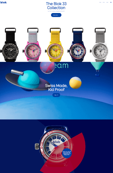
Blok Watches, for example, do exactly this by presenting their watch collection “built with precision, designed with gusto” in the hero section with high-quality visuals of the different variants.
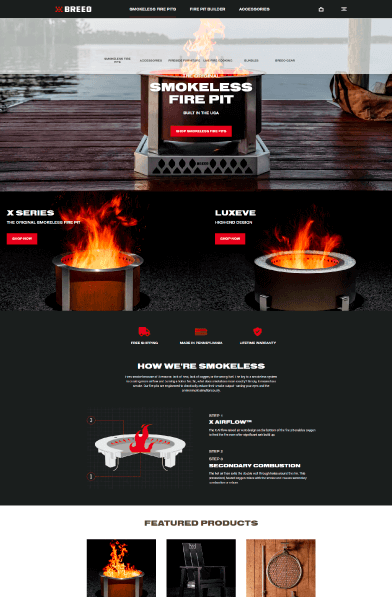
Breeo essentially does the same thing, communicating the Unique Value Proposition straight away: the original smokeless fire pit built in the USA.
Tip 3: Boost your UVP with the right visuals
Physical products require high-quality detailed images, services require demo screenshots, or you can use specific visuals that speak on an emotional level and communicate certain positive feelings.
For example, Flowerdose sells beautiful flower compositions that cater to different needs. They feature different style cards that communicate the emotions specific flowers and colors can influence. On one hand, they show a high-quality artistic image of an actual product, on the other, they also speak on an emotional level with the help of colors, contrast, lights, and shadows.
Tip 4: Focus on the benefits
Explain how your products or services help your specific target audience get their problem solved. For example, Aro Smart Box immediately lets you know that their product will reduce your time spend on your mobile device and will help you live a more productive life and focus on the things that matter.
2. Build a Clear and Easy Navigation
Your visitor shouldn’t think hard about where to find a particular category or a particular option. Make your navigation accessible at all times, easy to find, intuitive, and easy to understand. If you don’t have many products in many categories that require leveling, avoid drop-down mega menus at all costs.
For example, MiniLuxe keeps sticky navigation with 4 tabs that keep all options neatly and logically organized.
3. Highlight Your Most Popular Products
At first glance, promoting products that are already popular doesn’t seem very productive, however, there is logic to this tactic. Since popular products already have buyers, it means that they already solve a problem efficiently and it speaks volumes about the quality. Make sure you highlight your most popular products to attract potential buyers to purchase them as well as to invite them to have a look at other products and services you offer.
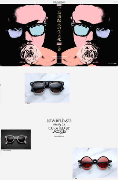
For example, the homepage of Jacques Marie Mage highlights “The Icons” of the new sunglasses collection.
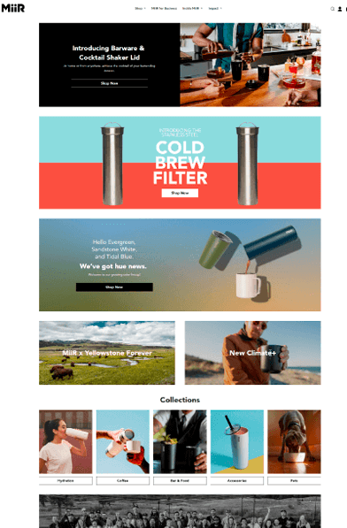
MiiR gives another example of highlighting popular products by introducing the stainless steel cold brew filter right in the beginning.
4. Recommend Products
Many visitors arrive to browse through products not looking to buy anything in particular. The best way to take advantage of the situation is to intrigue them by recommending your best and highest quality products. When it comes to design, make sure you put your best preview images, add hover effects, and other techniques to present these products emphasizing their most positive characteristics.
Ramboo Fashion features some of its best items right after the fold and presents them with high-quality product images and hover animations.
Sasai Jewelry collection does a similar thing for their best earrings by presenting them in demo photos that show the items in full detail and how they look on your ear. In addition, there’s also a smooth hover animation indicating which model you’re currently looking at.
Tala Single Ingredient Fruit Snacks features its best flavors above the Variety option with bold fonts and preview product images that appear on hover.
Another to go about it is to introduce your new arrivals or seasonal products. Especially for seasonal items, your visitors will be most compelled to buy them. The key is to be strategic in order to get the most conversions. In addition, featuring new products will help you test what kind of items your visitors are more willing to buy.
Egiazki starts right of with Selection of the Month to help visitors to rediscover the taste of the real thing.
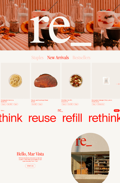
Re-Grocery combines its most popular products, its highest quality offers, and new arrivals above the fold in one section with tabs. Depending on what the visitor is interested in, it’s very convenient to just browse the carousels without the need to scroll down the Homepage.
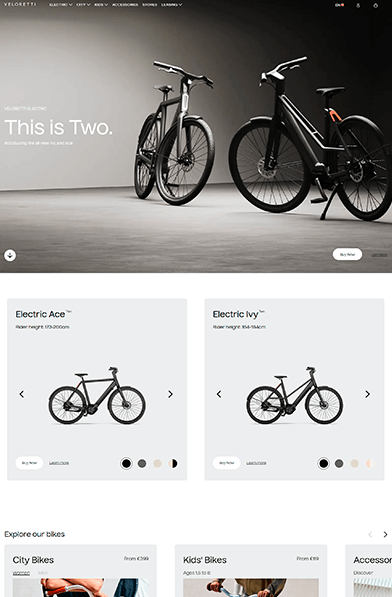
Veloretty displays its three main categories of bikes with eye-grabbing high-quality featured model images and hover animation. Each category leads to a product page showcasing the curated models. It is a great example of showcasing different products for every potential customer.
Vedran Badun Adventures is a personal traveling log with eCommerce functionality for merch items, featured on the homepage.
5. Display Contact Information
Let visitors call you for any questions that might be hindering their decision to buy. Having a business phone number featured as well as a physical address easy to access builds trust and presents you as a legitimate business.
✔️ Bonus Tip: Say Hello
Not all visitors will go to your About Us page to learn more about your business, history, solutions, and your team. However, you can still make a quick introduction to build trust if you put a small section where you introduce yourself to your visitors.
Fiat Lux Mission Jewelry features a personal story and a message to visitors to learn who is behind the making of the beautiful jewelry. This creates a more personal connection and lets users know the items are hand-made and not redistributed from other online stores.
6. Use High-Quality Images
High-quality accurate images not only look better and give visitors a detailed view of your products but also give your brand credibility as a trustworthy business. For this reason, avoid stock photos or if you’re re-selling original products, avoid using the images from the original provider and use your own instead.
Products should be clearly displayed using good-resolution images, and if possible, include photos for each variation and even videos.
Notorious Nooch strikes right away with product photos turned into animated elements in the hero section.
Sasai Jewelry also uses high-quality custom photography to present the earrings collection.
7. Make Your Call-to-Action Pop
CTA buttons can influence users to make decisions quickly and to feel confident about them. Make sure there are no distractions such as popups, social buttons, or irrelevant info competing with your CTA button. You can use a lot of white space to make it the sole focus of the section.
8. Build Trust with Social Proof
Some display of social proof on your homepage is a powerful way to showcase your reputation. Think of how best to show visitors the positive feedback you’ve received from your existing customers. They provide potential buyers with social proof of the quality of your brand.
Here’s how you can flex your credibility on your Homepage:
- Testimonials: Written directly by the client, testimonials are a vitally important part of any eCommerce website. Unlike reviews, you can actually control, collect, and publish client testimonials.
- Trust badges: They serve to denote security features that keep credit card details and other private information safe. Make sure to make them visible and let your visitors feel safe using your store.
- Awards: An awards section with a list of awards your brand has received.
Golden Wine, for example, has a lot to show off with its Award for Best Startup Winery and Innovation.
To Sum Up
A well-planned eCommerce homepage design helps increase sales and compels visitors to make a purchase. If we can sum up all the tips into one conclusion, always begin with your customers in mind when designing an eCommerce website. Make sure you display your unique value proposition right away; showcase your best and most popular products; and back up your credibility with social proof and reliable contact information.
The homepage, however, is just the storefront of your entire eCommerce website. Ideally, every single element you design should be a well-planned step of a shopping journey for visitors from the product pages to the end of the checkout process, contributing to their decision. So why not continue with 10 effective eCommerce website design tips you can start putting into practice, with examples?
In the meantime, you can visit some of the related articles for some more insights, and inspiration, or grab a freebie: