Design, UI, UX, Website Examples
15 of The Best School Websites in 2024 For Inspiration
A collection of excellent school website examples in the wild, all worthy of A+.
-
- March 21st, 2024

Looking for inspiration and ideas for your school’s website? You’ve come to the right place! We’ve curated a collection of 15 of the best school websites out there.
These websites excel in user-friendly design and engaging content, making them ideal models for colleges, high schools, and elementary schools alike. They provide valuable information as well as they have visually appealing layouts and effortless navigation. So, let’s dive in and explore what makes them so impressive. If you’re considering revamping your current site or starting from scratch, this inspirational article will surely serve as a source for valuable insights.
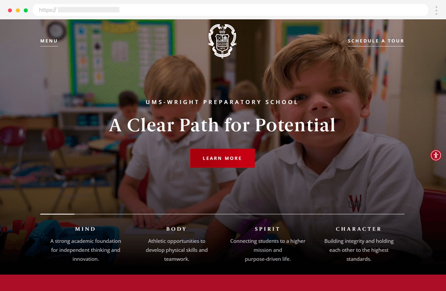
1. UMS Wright Preparatory School
The UMS-Wright Preparatory School website, designed by Mighty, offers a captivating online experience highlighting the institution’s rich legacy and esteemed reputation. It features a royal red and white color palette, evoking prestige and tradition. Visitors are greeted with a dynamic introductory video in the hero section, showcasing the vibrant school community. As users explore, they encounter a compelling About section detailing the school’s extensive history, accompanied by stimulating visuals.
Key Highlights:
- Engaging Introductory Video: Welcoming video showcasing the vibrant school community.
- Sophisticated Color Palette: Use of royal red and white colors reflecting the school’s prestigious status.
- Informative About Section: Detailed content about the school’s extensive history.
- Immersive Experience: Visitors can explore informative sections providing insights into the school’s spirit and heritage.
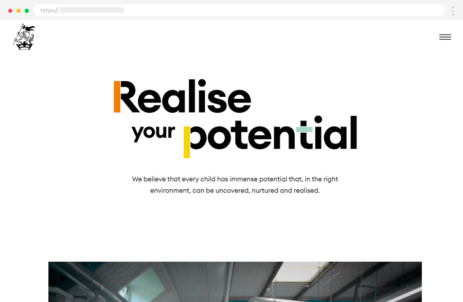
2. Wellington College
Wellington’s education website sets a new standard, showcasing its unique approach to learning. Visitors are captivated by full-screen videos of the college and its activities. Engaging scrolling animations and parallax effects enhance user interaction. The “Meeting the Headmaster” section provides insights into school leadership. Additionally, the site presents statistics about the Wellington community and academic performance. With well-structured navigation, users can easily access information. For instance, the Admissions menu offers comprehensive options for prospective students, including enrollment details, fees, and virtual tours.
Key Highlights:
- Horizontal scrolling.
- Full-screen videos and scrolling animations enhance user engagement.
- “Meeting the Headmaster” section provides insights into school leadership.
- Statistics highlight key metrics about the Wellington community and academic achievements.
- Well-structured navigation with sub-levels.
- The admissions menu offers comprehensive options for prospective students.
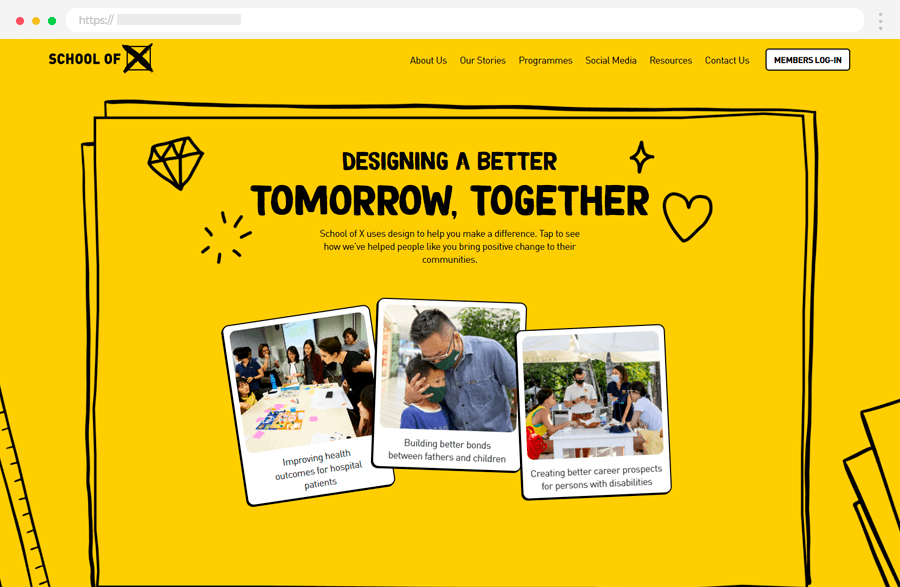
3. School of X
The School of X website stands out with its bold and vibrant color scheme, creating a visually appealing and engaging experience. It strikes a balance between being playful and informative, making it enjoyable for visitors to explore. One cool feature is how the website integrates past Instagram posts directly onto its pages, allowing visitors to easily connect with the school on social media. The font used throughout the site is easy to read yet visually pleasing, contributing to a positive user experience. Additionally, when you first land on the homepage, you’re greeted with visually striking layered images that add depth and interest to the design.
Key Highlights:
- Bold Color Scheme: Creates a visually appealing atmosphere.
- Instagram Integration: Embeds past Instagram posts for easy social media connection.
- Readable Font: Ensures ease of reading while maintaining visual appeal.
- Layered Images: Homepage features visually striking layered images for added depth.
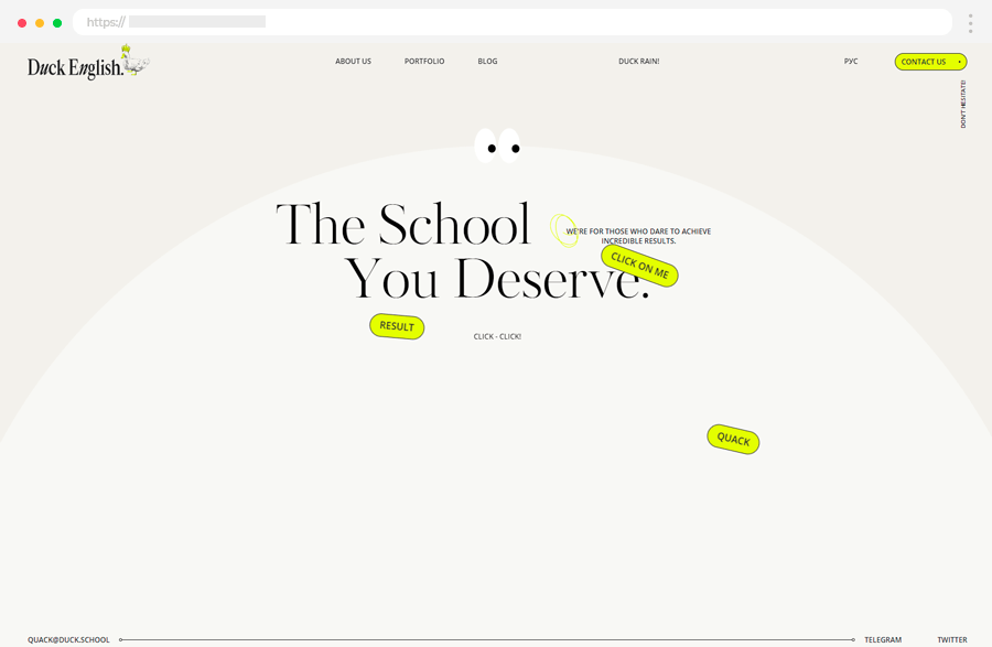
4. Duck English School
At Duck English, learning English means changing lives. This Russian-based school takes teaching seriously, focusing on homework and real results instead of quick fixes. While they don’t promise fluency overnight, they guarantee progress.
The website reflects their unique approach with a crowned duck mascot, clean design, big text, and neon accents. It’s dynamic, with scrolling animations and features like teacher introductions, downloadable stats, student testimonials, and a success story blog.
Key Highlights:
- Unique Branding: Crowned duck mascot and neon accents create a distinctive look.
- Modern Design: Sleek layout enhances user experience.
- Prominent Text: Big, clear text ensures important information is easy to find.
- Engaging Features: Scrolling animations and various sections keep visitors interested.
- Comprehensive Content: From teacher introductions to student testimonials, the website offers a wealth of information.
5. Cambridge Club Kyiv
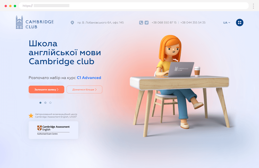
Cambridge Club Kiev is a popular English language school in Ukraine, offering both in-person and online training programs. They specialize in preparing students for exams like C1 Advanced, TKT modules 2 and 3, and Cambridge exams. Their website features a modern design with soft colors, fun 3D characters, and smooth scrolling animations.
On the homepage, you’ll find a simple layout listing all their training options, highlighting their advantages, and showcasing their global partners. They also include real testimonials from students, sourced from Google Reviews, to give you an idea of what to expect. Plus, they have a handy footer with all the site’s links neatly organized for easy navigation.
Key Highlights:
- Diverse Training Programs: They offer a range of English courses and exam preparations.
- Modern Website Design: The website has a fresh look with appealing visuals and smooth animations.
- Easy-to-Navigate Layout: The homepage provides clear information about their offerings and partnerships.
- Genuine Student Feedback: Real testimonials from Google Reviews offer insights into the school’s effectiveness.
- Convenient Site Navigation: The footer includes all site links for hassle-free browsing.
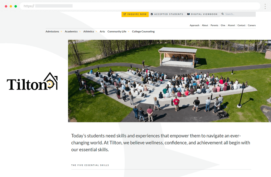
6. Tilton School
Tilton’s Digital Viewbook gives students and families a firsthand look into its unique boarding school experience. Designed to boost applications, foster community, and showcase the school’s brand, the viewbook features a captivating background video in the hero section, along with prominent UI elements and a thorough video tour of the campus. Rich in UI animations and interactions, it includes parallax effects, scrolling animations, and a broken grid layout, with custom shapes adding visual appeal.
Motion typography adds energy to the content, while authentic audio testimonials from students offer genuine insights. Visitors can explore success stories through written and video testimonials.
Key Highlights:
- Engaging Background Video: Grabs attention with dynamic visuals.
- Comprehensive Video Tour: Offers an in-depth look at campus facilities.
- Rich UI Animations: Enhance user engagement throughout the viewbook.
- Custom Layout: Utilizes unique shapes and a broken grid for visual appeal.
- Dynamic Typography: Adds energy to the content presentation.
- Authentic Testimonials: Provides genuine insights from current students.
- Success Stories: Showcases achievements through written and video testimonials.
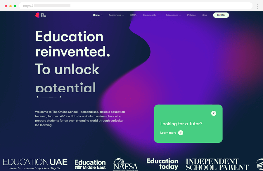
7. The Online School
The Online School provides personalized education for every student, following the British curriculum. Their focus is on learning driven by curiosity. The website has a modern design with moving backgrounds.
Key Highlights:
- Personalized Learning: Education that fits each student’s needs.
- Easy Access: Tutors are just a click away with a prominent button.
- Trustworthiness: Collaborations with publishers and global partners ensure high-quality education.
- Physical Locations: They have drop-in centers in Dubai, London, and Oxford.
- Engagement Options: Students can take quizzes and fill out forms to get started.
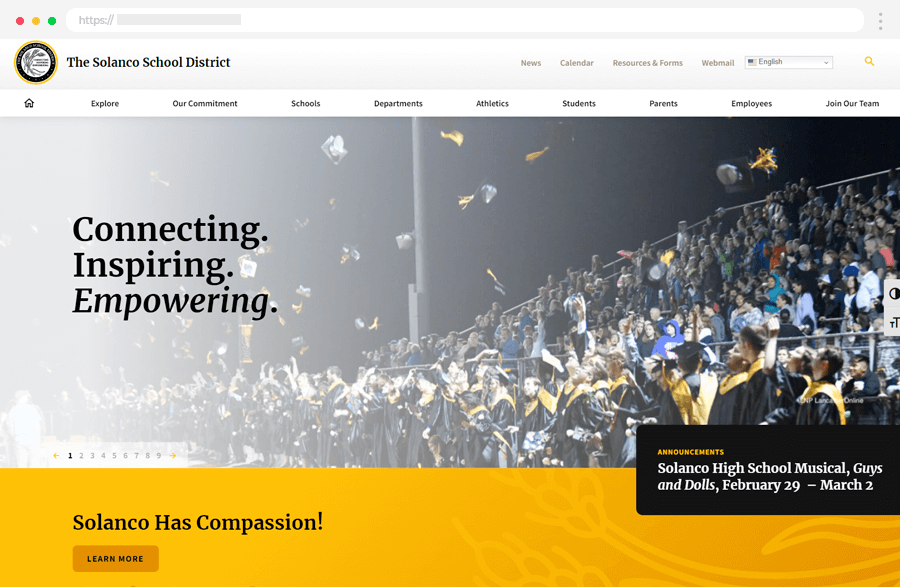
8. The Solanco School District
The Solanco School District website welcomes visitors with a powerful message: “Connecting. Inspiring. Empowering.” This statement immediately grabs attention, setting the tone for the visitor’s experience. The site makes it easy to connect with the school through links to its social media accounts. Icons accompany related links, like the middle school menu and upcoming events calendar, making it simple to navigate. Additionally, the website prioritizes accessibility with features like the color contrast toggle and font-size toggle, ensuring that everyone can easily access and engage with the content.
Key Highlights:
- Strong Message: “Connecting. Inspiring. Empowering.” sets the tone for the visitor’s experience.
- Social Media Links: Make it easy to connect with the school online.
- Iconic Navigation: Icons alongside links improve user experience and navigation.
- Accessibility Features: Color contrast toggle and font-size toggle prioritize inclusivity.
- Calendar Integration: Provides convenient access to upcoming events within the district.
9. Pulteney School
Pulteney, a leading co-ed school in South Australia, proudly presents its educators’ dedication and students’ motivation through its engaging and professionally designed website. With a history dating back to 1847, Pulteney cherishes its legacy as a school committed to academic excellence.
The website has a professional government-style design in navy blue and white, showing the school’s serious and professional side. It provides curriculum details tailored for different age groups and has a comprehensive FAQ section to answer common questions. Visitors can easily book a tour of the campus with a teacher, giving them a chance to experience the school firsthand.
Additionally, the website’s full-screen menu organizes content into clear categories, making it easy to find what you need.
Key Highlights:
- Professional Design: Reflects the school’s serious and professional approach.
- Comprehensive FAQ Section: Answers common questions.
- Campus Tours: Let visitors experience the school firsthand.
- Clear Navigation: This makes it easy to find information on the website.
10. CIS International School
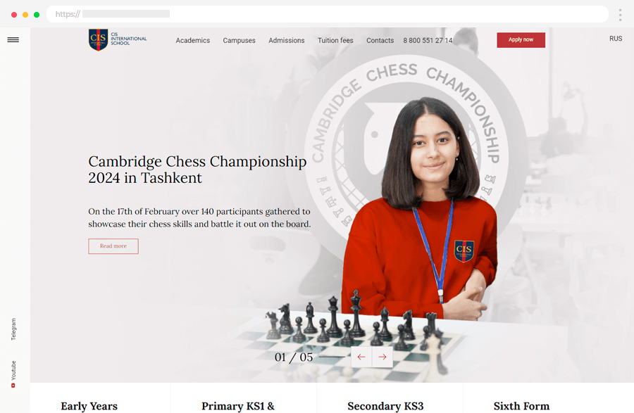
CIS International School’s website is designed to inspire students to become responsible, innovative, and open-minded global citizens, while also showcasing their academic excellence and social skills. The website has a professional yet engaging design, proving that modern websites can still look polished.
The school focuses on helping students succeed academically and socially. With sliders stylishly showcasing relevant content, the website makes a great first impression. Its easy-to-use menu lets visitors explore different education levels effortlessly.
Plus, there are sticky sidebar links to keep visitors engaged and connected with the school community.
Key Highlights:
- Empowering Design: Encourages students to take responsibility and be innovative.
- Academic Excellence: Highlights students’ academic skills and social abilities.
- Dynamic Presentation: Sliders display content stylishly to capture visitors’ attention.
- User-Friendly Navigation: A simple menu makes it easy for visitors to find what they need.
- Social Media Integration: Sticky sidebar links keep visitors engaged and connected.
11. Adelaide Botanic High School
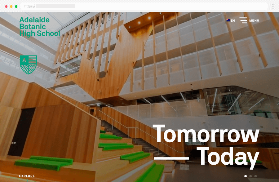
Adelaide Botanic High School’s website has a sleek and modern look, focusing on the school’s branding and images. The menu is straightforward to use, so you can find what you’re looking for without any hassle. Interactive features like the interactive map make the website engaging and give visitors a real sense of what the school is like.
Key Highlights:
- Modern Design: Highlights the school’s branding and images.
- User-Friendly Menu: Makes navigation simple and hassle-free.
- Interactive Features: Such as the interactive map, add engagement.
12. Nuasin Next Generation School
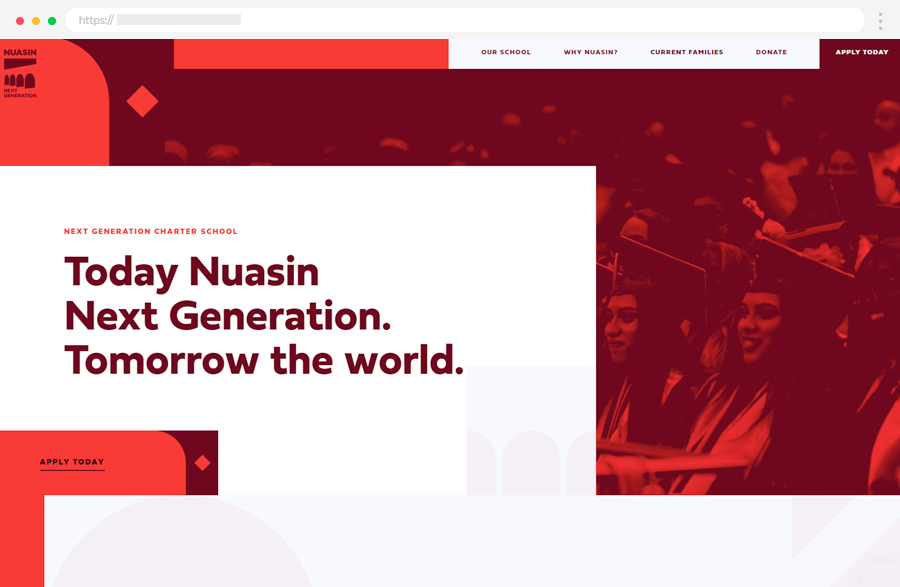
Nuasin Next Generation is a free K–12 public charter school that’s all about helping students thrive in college, career, and life. Whether you’re after a sleek website design or timeless elements, they’ve got you covered. Their website stands out with bold primary colors, especially red. With images that focus on people, classic design, and vibrant colors, this site offers great insights into effective web design.
Key Highlights:
- People-Focused Images: Putting students and educators front and center for a personal touch.
- Classic Web Design: Embracing timeless principles for a lasting impression.
- Highly-Tinted Images: Using vibrant colors to make the website memorable and engaging.
13. Winchester College
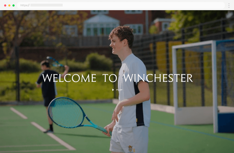
Winchester College is a prestigious boys’ boarding school with a 600-year history. It recently underwent a significant repositioning project and launched a new website. This effort aimed to modernize the school’s image and ensure its relevance in the present day.
Key Highlights:
- Rich Legacy: Winchester College boasts a centuries-old history of excellence.
- Modernization Efforts: The school has undertaken initiatives to update its brand and appeal to contemporary audiences.
- Website Revamp: The launch of a new website reflects Winchester College’s commitment to staying current and accessible.
14. Sanderling Waldorf School
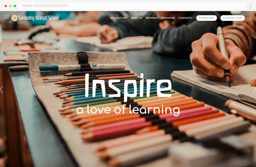
Sanderling Waldorf School’s website is designed to look good and give information, making it attractive for people thinking about sending their kids there. The main picture at the top of the page immediately grabs your attention with important details about the school.
One cool thing about the site is a video where current students and parents talk about their experiences, giving a real sense of what the school is like. The warm colors used across the site make it feel friendly and inviting, which matches the school’s values.
Key Highlights:
- Eye-Catching Homepage Banner: Shows important school details right away.
- Testimonial Video: Features real students and parents talking about their experiences.
- Welcoming Color Scheme: Gives the site a friendly feel that matches the school’s values.
15. Marcellin College
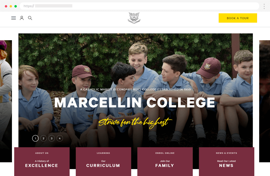
And last, we have Marcellin College. This Catholic boys school in Melbourne shows its dedication to students’ education through its website design. Founded by the Marist Brothers to educate boys in Melbourne, the site has a modern look with simple, animated features.
Key Highlights:
- Modern Design: The website has a sleek, updated design with animations for a more engaging experience.
- User-Friendly Navigation: A simple menu makes it easy for visitors to find what they need.
- Campus Tours: Let visitors experience the school firsthand.
10 Tips for Designing an Effective School Website
Crafting a top-notch school website will help keep everyone in the loop, from students to parents and everyone involved. This is why, we’ve put together 10 handy tips for designing a school website that gets the job done from making your homepage easy to navigate to integrating social media.
✔️1. Make the homepage user-friendly
Keep things simple and easy to find. Put important info like news, events, and links to key pages right up front. For example, you could have a big banner with the latest news, a calendar showing upcoming events, and a menu with quick links to things like admissions and curriculum.
✔️2. Make it accessible
Your website should be easy for everyone to use, even if they have disabilities. Use clear fonts, describe images for people who can’t see them, and make sure the colors work well together. You could even try using a screen reader to check how accessible your site is.
✔️3. Get Social
Add buttons for sharing and following your school’s social media accounts. This helps people spread the word and feel more connected. You could let visitors share articles or events on platforms like Facebook, Twitter, and Instagram.
✔️4. Keep navigation simple
Organize your menu so it’s easy to find what people are looking for. Use clear labels and categories like About Us, Academics, Admissions, and Contact Us. That way, visitors can quickly find the info they need.
✔️5. Highlight important pages
Put popular pages like contacts, curriculum, admissions, and the calendar front and center. This makes it easy for everyone to find the most important stuff. You could have a “Quick Links” section on the homepage for fast access.
✔️6. Use a CMS to update your site more easily
Choose a content management system (CMS) that’s easy for anyone to use. That way, staff can keep the website up to date without needing technical skills. Platforms like WordPress or Squarespace are great options.
✔️7. Show your calendar
Make sure your school’s calendar is easy to find. This helps everyone stay in the loop about events, holidays, and other important dates. You could have an interactive calendar on the homepage that lets people filter events by date or category.
✔️8. Celebrate student success
Create a section of your website dedicated to showcasing student achievements. This lets everyone see the awesome things your students are doing. You could feature profiles of outstanding students and their accomplishments.
✔️9. Add some flair
Use photos, videos, and other multimedia to make your website more interesting. This helps bring your school’s story to life and gives visitors a glimpse into campus life. Share photos from events, take people on a virtual tour, and include testimonials from students and parents.
✔️10. Get feedback and get better at it
Ask parents, students, and staff for feedback on your website. Use their suggestions to make it even better. Add a feedback form or survey to your site so people can easily share their thoughts. Then, review the responses regularly to see where you can make changes.
Alrighty, folks, that’s a wrap!
So, what have we learned from these school websites? Well, they’ve shown us that a great school website is about being user-friendly, informative, and engaging. Schools can create websites that truly serve their communities. From making navigation a breeze to incorporating social media, there are plenty of ways to make your school website shine. So, here’s to building websites that students, parents, and teachers will love to visit!
Hey, before you go, don’t forget to check out our other awesome articles on UI/UX design! We’ve got loads of tips and inspiration to help you create stunning designs that will blow your mind.