Design, UI, UX, Inspiration, Web Development, Website Examples
14 of The Best Government Website Design Examples
We breakdown 14 live government websites to find what makes them work
-
- January 15th, 2024

Government websites serve as virtual hubs connecting citizens with essential public services. A well-designed government website is not just a visual display but a practical tool for users seeking information, conducting transactions, and engaging with civic matters. When it comes to what defines the best government website design, we should start with simplicity, functionality, and a commitment to user-centricity.
Efficiency lies at the core of a great government website design. It blends functionality with a user-friendly experience, ensuring that citizens, irrespective of their digital proficiency, can effortlessly find information, complete tasks, and interact with services. From mobile responsiveness to intuitive search functionalities, these websites prioritize accessibility, responsiveness, and empowerment in digital interactions. The best government website designs reflect a keen understanding of the diverse demographics and needs of the user base, providing a streamlined approach to navigating the complexities of public services.
Now, let’s dive into the 14 best government websites that stand as benchmarks of digital public service. Each of these websites, from the streamlined efficiency of Gov.uk to the visually captivating NASA site, has unique attributes contributing to an excellent user experience.
The 14 Best Government Website Design Examples
Without further ado, let’s jump straight into the examples. These platforms embody the principles of user-centric design, showcasing the transformative power of digital interfaces when dealing with citizen-government interactions. We’ll analyze what makes these websites exceptional, and see what we can learn from each.
1. State of Oregon Government Website
The State of Oregon’s official website makes a strong impression with its visually appealing design. Upon entering the site, visitors are welcomed by a captivating video showcasing the natural beauty of Oregon, including its picturesque mountains and rich cultural offerings. The video effectively communicates the state’s unique identity and tourist attractions.
What enhances the user experience is the intuitively designed main page, which is easy to navigate. The seamless layout contributes to the overall accessibility of information, allowing users to find what they need without hassle. The website’s success is further highlighted by its professional-looking menu, which adds a touch of sophistication to the user interface.
Additionally, the creative design of the logo on the Oregon website adds a modern and innovative flair, contributing to the site’s overall aesthetic appeal.
Key Takeaways:
- Visual Appeal: Oregon’s website impresses with captivating visuals showcasing the state’s beauty and cultural richness.
- Easy Navigation: The intuitively designed main page ensures hassle-free user navigation, enhancing accessibility.
- Professional Aesthetic: A polished menu adds sophistication to the user interface, emphasizing professionalism.
- Creative Branding: The modern logo design adds an innovative touch, highlighting the importance of creative branding for government websites.
In essence, the State of Oregon’s government website serves as a noteworthy example for other government websites to emulate, emphasizing the importance of visual engagement, user-friendly navigation, and a professional yet creative design approach.
Visit Website
2. State of Mississippi Government Website
Mississippi’s state government revamped its official website in 2013, and even a decade later, it continues to stand out, earning the title of Best Government Website of the Year in 2022. Crafted by Mississippi Interactive, a subsidiary of eGovernment company NIC, the website prioritizes its residents and businesses. Dr. Craig Orgeron, Mississippi’s Chief Information Officer, emphasizes the site’s commitment to staying ahead in the evolving landscape of technology and user interactions. The mobile-first approach aligns with the dynamic needs of end users, solidifying Mississippi’s position as an eGovernment leader.
The outstanding features of Mississippi’s website include a fully responsive and user-friendly design, providing up-to-date information in an engaging manner. Innovative elements like swipe sliders, touch-enabled content boxes, and a dynamic search bar animation enhance user interaction. The website also incorporates unique accessibility toggle features, allowing users to customize their experience according to their needs. With inspiring high-resolution photography and clean, easy navigation, the site radiates professionalism.
Upon entering the Mississippi government website, users are greeted with an image representing the state’s justice system, setting a tone of professionalism and readiness to serve. Notably, the design incorporates plenty of white spaces, contributing to a clean and uncluttered layout.
Key Takeaways:
- Sustained Excellence: Mississippi’s government website, revamped in 2013, remains the Best Government Website of the Year in 2022, showcasing enduring excellence.
- User-Focused Design: The site prioritizes residents and businesses, emphasizing a commitment to technology and user interaction.
- Innovative Features: The website boasts elements like swipe sliders and dynamic search, enhancing user engagement.
- Professional and Clean: The homepage exudes professionalism, complemented by a clean layout with strategic use of white spaces for user-friendly navigation.
Mississippi’s website design offers valuable lessons in the importance of high-quality images, a professional layout, and the strategic use of whitespace for an enhanced user experience.
Visit Website
3. AXON Mission-Driven Website Design
Axon Enterprise, Inc., headquartered in Scottsdale, Arizona, is an American company specializing in the development of technology and weapons products for military, law enforcement, and civilians. As a mission-driven organization, Axon is dedicated to protecting life and minimizing its environmental impact. The company actively seeks opportunities to promote positive environmental practices across all its facilities, operations, customers, staff, and communities.
Upon entering Axon’s website, one is immediately struck by its futuristic and visually appealing layout. The bird’s-eye view of the city is particularly noteworthy, showcasing a design that is both innovative and cool for a company of its nature. The website’s design, credited to the web designer, is commendable, offering a fresh and engaging experience for visitors.
Key Takeaways:
- Mission-Driven Focus: Axon Enterprise, Inc. is dedicated to protecting life and prioritizes minimizing environmental impact across its operations.
- Futuristic Design: Axon’s website features a visually appealing and futuristic layout, evident in the bird’s-eye view of the city, providing an innovative and cool representation of a technology and weapons company.
- Design Elements: The use of a cool font style adds a modern touch, while high-quality images contribute to a visually striking presentation, capturing user attention.
- User-Friendly Navigation: The website ensures a seamless user experience with easy menu navigation, allowing visitors to quickly access the information they need.
In dissecting the elements of Axon’s website design, a few key takeaways emerge. The use of a cool font style adds to the overall modern and futuristic vibe. The high image quality contributes to a visually striking presentation, capturing the attention of users. Furthermore, the website’s easy menu navigation enhances user experience, ensuring that visitors can quickly find the information they need.
Visit Website
4. The Internal Revenue Service IRS Official Website
The IRS website stands out as a stellar example of what federal government websites should strive to achieve. The design company responsible for this site demonstrated clear expertise, delivering a professional and clean design that instills trust and credibility.
This federal government website’s key features include its clean and professional design, fostering a sense of reliability and confidence. Navigating the site is a breeze, thanks to its user-friendly layout. The traditional blue, gray, and white color palette aligns perfectly with the official purpose of the website, creating a visually appealing and authoritative online presence.
The IRS website underwent significant upgrades, notably in 2017, with a focus on accessibility, mobile-friendliness, and overall organizational improvements. This redesign aimed to make tax-related processes more efficient for users, reducing the strain on agency phone lines. The website stands as a global leader among tax agency sites, emphasizing accessibility, user-friendliness, and efficient organization.
Noteworthy features of the IRS website include its aesthetically pleasing clean design centered on calming blues, a rotating banner showcasing diverse individuals engaged in various activities, and a concise banner message explaining the agency’s purpose. The “How can we help you” menu, accompanied by appealing iconography, streamlines user access to major services.
Key Takeaways:
- Exemplary Design: The IRS website sets a high standard for federal government sites. Professional, clean, and trustworthy design, demonstrating expertise from the design company.
- User-Friendly Layout: Navigating the site is easy, thanks to its user-friendly layout.
- Visual Appeal: The traditional blue, gray, and white color palette creates a visually appealing and authoritative online presence, aligning with the official purpose of the website.
The website’s multiple organizational structures provide varied access points, ensuring easy navigation. Moreover, the inclusion of content in 21 languages and a mobile-friendly design further enhance the site’s accessibility and usability.
Visit Website
5. The National Aeronautics and Space Administration Website
NASA’s logo is iconic, making its mark in pop culture on t-shirts and caps. The federal agency boasts some of the most recognizable branding, and its website is a standout among federal government sites, perfectly encapsulating NASA’s identity.
This federal government website design stands out for its easily identifiable choice of colors and backgrounds, aligning seamlessly with the NASA logo and brand. The site features eye-catching placement of high-quality space photography, adding visual appeal and capturing the essence of NASA’s mission.
Notably, the website excels in making navigation to relevant news a quick and easy process. The user-friendly design ensures that visitors can swiftly access the latest updates and information.
Key Takeaways:
- Iconic Branding: Effective federal government site design, aligning seamlessly with the agency’s iconic logo and branding.
- Visual Harmony: Easily identifiable colors and backgrounds complement the NASA logo. Eye-catching space photography that visually captures the essence of NASA’s mission.
- Efficient Navigation: Swift and easy navigation to relevant news and information, enhancing the overall user experience.
- Optimal User Experience: NASA’s website harmonizes visual identity, engaging imagery, and streamlined navigation, serving as a prime example of effective federal government website design.
To sum up, NASA’s website is a prime example of effective federal government website design, harmonizing visual identity, engaging imagery, and streamlined navigation for an optimal user experience.
Visit Website
6. The United States Postal Service Website
USPS.com earns recognition as one of the best federal government websites due to its savvy use of color and graphics. The site boasts a visually appealing design, incorporating blocks, buttons, icons, and illustrations that breathe life into its overall appearance.
The distinguishing features of this federal government website design include on-trend and modern graphics, adding a contemporary touch to its visuals. Notably, it employs a bold use of accent colors alongside traditional blues and grays, creating a dynamic and engaging aesthetic.
Key Takeaways:
- Visual Appeal: USPS.com stands out as one of the best federal government websites. It has a visually appealing design with vibrant blocks, buttons, icons, and illustrations that inject life into its appearance.
- Contemporary Graphics: The site incorporates on-trend and modern graphics. This gives it a contemporary touch and contributes to a visually dynamic aesthetic.
- Bold Color Palette: A bold use of accent colors alongside traditional blues and grays.
- Optimized UI/UX: Easy navigation to services and information, providing visitors with an efficient browsing experience.
Moreover, the website is meticulously designed for optimal user interaction and experience. Its user interface (UI) and user experience (UX) are optimized to ensure easy navigation to services and information. The thoughtful design elements contribute to a seamless and efficient browsing experience for visitors.
Visit Website
7. Kansas City Government Website
Kansas stands out from the norm of professional and neat government website designs. Upon entering their site, visitors are greeted with a mural crafted by a local artist, showcasing the cultural richness of the state. This creative approach effectively highlights the talents of Kansas citizens, providing a unique and engaging entry point.
Key takeaways from this distinctive website design include its creativity, evident in the incorporation of local art. The menu navigation is user-friendly, ensuring a smooth and intuitive browsing experience. The layout is sleek, contributing to the overall aesthetic appeal and making the website visually appealing.
In addition, the website’s design is uncluttered, emphasizing easy access to popular services and featuring a dedicated search form, Resource Lookup, for personalized service information. The inclusion of a visible 311 tab facilitates problem reporting for residents, demonstrating a focus on user convenience.
Key Takeaways:
- Creative Entry Point: Local artist’s mural provides a unique and engaging welcome.
- User-Friendly Navigation: Ensures a smooth and intuitive browsing experience.
- Sleek Layout: Contributes to overall aesthetic appeal, making the site visually engaging.
- Uncluttered Design: Emphasizes easy access, and features a dedicated search form for personalized service information.
Kansas City’s website design is characterized by the smart use of buttons and links for improved navigation and engagement. The content remains up-to-date and relevant, keeping pace with current affairs.
Visit Website
8. U.S. Navy Government Official Website
The U.S. Navy’s federal government website stands out for its striking visual appeal. The design takes a bold approach, featuring a captivating photograph of a U.S. Navy Zumwalt-class destroyer. This choice transforms the website from a purely utilitarian platform to one that is truly eye-catching.
Key elements that distinguish this federal government website design include the bold selection of relevant background photography. The website also features visible links to its social media platforms and pages, fostering connectivity with the audience and enhancing user engagement.
Key Takeaways:
- Striking Visual Appeal: The U.S. Navy’s website is visually captivating, featuring a bold photograph of a Zumwalt-class destroyer.
- Relevant Background Photography: The design incorporates a bold choice of relevant background imagery.
- Visible Social Media Links: Foster connectivity and enhance user engagement.
- Simple, Clean Layout: The website’s design is simple, clean, and easy to navigate.
Additionally, the layout is simple, clean, and easy to navigate, contributing to a seamless user experience.
Visit Website
9. City of Hamilton Canada Official Website
The City of Hamilton’s website, a significant milestone for Evolving Web, marked their first official city project. Situated in a major urban center with nearly 800,000 people (Canada’s ninth-largest urban area), the project dealt with diverse stakeholder needs and potential competing demands.
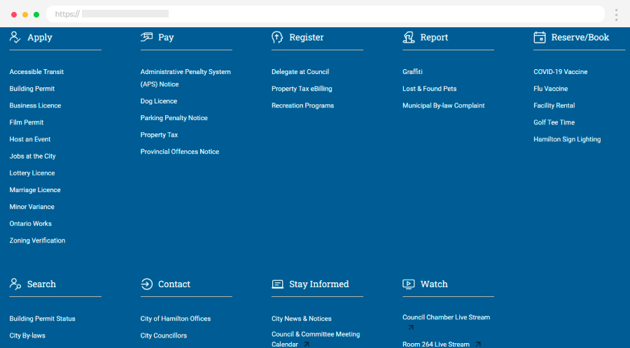
The primary goal was to create an organized, clean, transparent, and inclusive website that engages users and provides efficient tools for information retrieval. The focus was on visual appeal for both younger and older demographics, with a keen eye on accessibility. This involved fine-tuning color contrasts and text size for an older audience, prioritizing mobile friendliness, and ensuring compatibility with social media platforms.
Standout features of the website include a friendly and inviting tone, vibrant photography, and a robust search tool with multiple ways to categorize and filter information. An intuitive “I Want To…” drop-down menu directs users to popular topics, while icons throughout the site aid navigation.
Key Takeaways:
- Significant Milestone: City of Hamilton’s website is a major achievement for Evolving Web, marking their first official city project.
- Diverse Stakeholder Focus: Developed to address the needs of a major urban center with nearly 800,000 people.
- Organized and Inclusive Design: Aims for an organized, clean, transparent, and inclusive website for efficient information retrieval.
- User-Centric Design: Focuses on visual appeal for both younger and older demographics, with attention to accessibility and mobile friendliness.
- Standout Features: Friendly tone, vibrant photography, robust search tool, and an intuitive “I Want To…” menu enhance user experience.
The compact navigation sidebar avoids overwhelming users with too many choices, and a prominent design for alerts and notifications, based on a color coding and icon system, keeps users informed about recent city developments.
Visit Website
10. State of Victoria Australia Government Website
The Vic.Gov.Au website for the state of Victoria, Australia, is a multifaceted platform. It offers access to grants and services, keeping residents informed about events in the region, and providing a channel for public input on government decisions.
Upon entering the site, users are greeted with a section of popular searches, prioritizing ease of access to frequently sought-after information. The website covers a diverse range of topics, including job opportunities, the Working with Children Check, NDIS Worker Screening Check, and updates on coronavirus, reflecting a commitment to addressing the varied needs of the community.
The design of the website is not only functional but also aesthetically pleasing. Sticky main navigation ensures that key features are always accessible, and the use of vibrant and colorful shapes in the background enhances the visual appeal. The inclusion of card sections with a drop shadow effect on hover adds a touch of interactivity, making the browsing experience engaging and user-friendly.
The website also integrates key calendar dates further demonstrating a commitment to keeping the public well-informed.
Key Takeaways:
- Multifaceted Platform: Vic.Gov.Au offers grants, event info, and public input, ensuring a comprehensive user experience.
- User-Centric Design: Prioritizes easy access with a section for popular searches.
- Diverse Topics: Covers jobs, safety checks, and coronavirus updates for community needs.
- Functional and Aesthetic: Sticky navigation, vibrant shapes, and interactive cards enhance usability.
- Essential Government Links: Provides crucial housing, health, and alcohol service links for residents and visitors.
This amalgamation of functionality, visual appeal, and informational depth positions the Vic.Gov.Au website as a valuable tool for residents to stay updated on critical government-related matters and actively engage with the services and decisions that impact their lives.
Visit Website
11. Québec Tourism Industry Alliance Website
Governments need top-notch tax websites, and the same goes for tourism sites, albeit for different reasons. While tax sites aim for less hassle, tourism bureaus strive to attract travelers. An outstanding website can work wonders in showcasing a destination.
In 2020, the Alliance de l’industrie touristique du Québec transformed into “Bonjour Québec.” This name reflects the Francophone culture and warm hospitality that make Québec a unique destination. Alongside this rebranding, a new website emerged, designed to spotlight the province’s diverse tourism spots and provide an easy and enjoyable user experience for visitors.
This revamped website boasts several notable features. The user interface design is not just functional but also inspiring. Dynamic animations breathe life into the content, making the site engaging. Importantly, it is fully responsive, ensuring a smooth experience on all devices. The “Plan a Trip” section stands out, allowing users to explore different regions of Québec and its myriad offerings in an immersive online setting.
Moreover, the website offers fully customizable mapping and a convenient drag-and-drop itinerary planner. A powerful custom search engine enhances user accessibility.
Key Takeaways:
- Inspiring UI Design: The rebranded “Bonjour Québec” website boasts a functional and visually inspiring user interface.
- Immersive Features: Dynamic animations bring content to life, and a “Plan a Trip” section provides an immersive exploration experience.
- User-Friendly Tools: Fully customizable mapping and a drag-and-drop itinerary planner enhance user convenience.
- Global Accessibility: Full multilingual capabilities, including a robust fallback system, cater to a diverse global audience.
Additionally, the website caters to a global audience with full multilingual capabilities in French, English, and Spanish. An intricate fallback system ensures accurate results even when an exact translation is unavailable.
Visit Website
12. Gov UK Simple Functional Website Design
Gov.uk, the UK government’s official website, is widely praised for its exceptional design and functionality. The site’s elegant and minimalist layout ensures swift access to government services and information. The homepage strategically showcases key topics and popular services for quick user navigation. Gov.uk places a high priority on accessibility, offering features like high contrast options and text resizing for user convenience.
Several factors contribute to Gov.uk’s excellence, including rapid loading speeds, well-organized content, consistent communication, and a strong commitment to user experience. The website strategically removes barriers, such as unnecessary navigation elements and organization-focused content.
A standout feature is the brilliant service navigation on the homepage, where the entire layout serves as the main navigation. It logically categorizes services without requiring users to understand intricate government structures, allowing constituents to accomplish tasks without navigating complex offices.
Each top category link smoothly guides users to the next level of content organization. Importantly, the website provides clear subtopics with concise descriptions, offering users a preview as they navigate deeper.
Key Takeaways:
- Efficient User Navigation: Gov.uk’s minimalist layout and strategic placement of key topics facilitate swift access to government services.
- Accessibility Commitment: High contrast options and text resizing features prioritize accessibility for all users.
- Cost Savings: The website achieved significant cost savings of £61.5 million ($85.9 million) in 2015, showcasing its efficiency.
- User-Centric Design: The brilliant service navigation on the homepage simplifies the user experience, removing barriers and streamlining interactions.
Gov.uk’s emphasis on simplicity, user-centric design, and efficient communication sets a remarkable standard for government websites, showcasing how prioritizing user experience leads to successful and cost-effective digital services.
Visit Website
13. Ministry for Europe and Foreign Affairs France Diplomacy Website
The official France Diplomacy government website serves as a comprehensive resource for individuals planning to come to France. Within this section, users can access practical information and find links to the agencies of the Ministry for Europe and Foreign Affairs, offering specific advice tailored to their needs.
Despite being content-heavy, the website is adeptly structured, covering essential topics such as the ministry’s structure, foreign policies, country files, COVID-19-related information, visa requests, and details for various purposes like visiting, studying, or investing in France.
Navigation on the website is designed for user convenience, with quick links prominently featured on the homepage to the main topics. This thoughtful arrangement facilitates swift access to pertinent information, ensuring a seamless experience for visitors.
Key Takeaways:
- Comprehensive Information Hub: The France Diplomacy website provides extensive details on topics like ministry structure, foreign policies, and COVID-19-related information.
- User-Centric Navigation: Quick links on the homepage streamline access to main topics, ensuring user convenience.
- Tailored Advice: Users can find specific advice from the Ministry for Europe and Foreign Affairs, personalized to their needs.
- Efficient Information Retrieval: The user-friendly interface simplifies the process of finding specific details, enhancing the overall efficiency of the website.
A particular highlight is the website’s user-friendly interface, which transforms the process of finding specific details for one’s case into a straightforward and efficient task, making the France Diplomacy website an invaluable tool for those planning their endeavors in the country.
Visit Website
14. The National Oceanic and Atmospheric Administration Website Design
The National Oceanic and Atmospheric Administration (NOAA) is a scientific and regulatory organization within the United States, that oversees fishing, deep-sea exploration, ocean charting, and the protection of marine mammals and endangered species. It operates under the Department of Commerce.
NOAA’s website stands out as one of the best federal government designs, prioritizing usability and simplicity. The menu is compact, providing ample space for informative content and captivating images. The website employs branding, iconography, and a well-chosen color palette that aligns with its purpose and theme.
Key features that distinguish this federal government website design include a simple, easy-to-navigate, and uncluttered user interface. The website seamlessly adapts to various devices, including mobiles, laptops, and PCs. The on-brand color palette and effective use of iconography contribute to a cohesive and visually appealing design.
Key Takeaways:
- Usability and Simplicity: NOAA’s website prioritizes user-friendliness with a simple, easy-to-navigate interface.
- Adaptability: The site seamlessly adjusts to different devices, ensuring a consistent and accessible experience.
- Branding Excellence: Effective use of branding, iconography, and a cohesive color palette aligns with NOAA’s purpose and enhances visual appeal.
- Clean and Uncluttered Design: The website maintains a clutter-free layout, emphasizing relevant content and captivating imagery.
To sum up, NOAA’s website serves as a prime example of superior usability and thoughtful design within the realm of federal government websites.
Visit WebsiteWhat Is A Government Website?
Government website design involves creating a specialized CMS (government content management system) for government organizations to manage digital content creation and storage.
In contrast to private sector website design, government websites must focus on citizen behavior, catering to a diverse demographic, including people with disabilities. The design should prioritize mobile-friendliness, responsiveness, and accessibility to ensure easy information delivery and task completion for all citizens.
Citizens expect seamless experiences from government websites, necessitating features like easy navigation with search capabilities, prominent display of top services, and personalized experiences based on geography. Local government websites can build stronger communities, serving as the primary source of information for citizens. These websites should be task-oriented, understanding customer journeys, especially as citizens increasingly turn to digital channels for news, information, business transactions, and communication with local government.
Basically, local government website design, informed by data and citizen behavior, aims to enhance citizen satisfaction and engagement. An effective government website, like those powered by govAccess, prioritizes advanced self-service functionality and two-way communication channels.
The importance of a well-designed website for local government lies in meeting residents’ expectations for fast, digital access to essential services and information, ultimately contributing to efficient governance and community enrichment.
Key Takeaways:
- Government website design involves creating a specialized CMS for managing digital content by government organizations.
- Unlike private sector designs, government websites must prioritize accessibility, mobile-friendliness, and responsiveness to cater to a diverse citizen demographic.
- Features like easy navigation, prominent service displays, and personalized experiences based on geography are crucial for citizen satisfaction.
- Local government websites serve as vital sources of information, requiring a task-oriented design.
- An effective government website, informed by data and citizen behavior, enhances citizen engagement and satisfaction.
- Advanced self-service functionality and two-way communication channels contribute to the importance of a well-designed local government website.
Let’s Wrap It Up!
The best government websites, as we saw in the 14 cases we discussed, embody key principles that prioritize citizen-centric design and functionality. These exemplary websites showcase a commitment to providing useful, timely, and accessible information to a diverse audience.
Here’s how these websites align with the essential purposes and features outlined:
-
Ease of Obtaining Services:
Gov.uk, Mississippi, Victoria (Vic.Gov.Au), and Oregon excel in offering citizens seamless and quick access to various services. Their user-friendly designs facilitate tasks such as paying bills, applying for permits, and accessing vital information.
-
Mobile Access:
Oregon, Mississippi, and Kansas government websites incorporate responsive designs, ensuring that citizens can easily navigate and access information on various devices, including smartphones.
-
Searching for Information:
Gov.uk, Victoria (Vic.Gov.Au), and IRS prioritize intuitive search functionalities, allowing users to find information quickly without an in-depth understanding of the government’s organizational structure.
-
Social Media Engagement:
NASA and USPS.com leverage social media effectively, connecting with citizens through platforms like Twitter and Facebook. They recognize the importance of meeting people where they are and disseminating information through popular channels.
-
Live Help and Chat Bubbles:
Mississippi and Nebraska’s state government websites provide live chat options, offering citizens quick assistance during regular working hours. This feature enhances user experience and reduces reliance on prolonged phone calls.
-
Geographical Intuitiveness:
Mississippi and California implement geographical intuitiveness on their websites, tailoring information based on users’ locations. This personalized approach enhances the relevance of the content, offering location-specific details.
-
Notification Services:
Orange County, Florida, and Louisville, Kentucky, stand out for their notification services, allowing residents to subscribe to alerts for various events. These services contribute to higher citizen engagement and safety.
To sum up, the best government websites go beyond aesthetics, embodying the principles of citizen-driven design. They prioritize ease of service, adapt to mobile needs, facilitate information search, engage citizens through social media, offer live assistance, consider geographical nuances, and provide notification services. These features collectively contribute to a positive user experience, ensuring that government websites are valuable resources for citizens.
In the meantime, let’s explore more insights and resources on web design and web development by checking out our other articles!