Design, UI, UX, Inspiration, Website Examples
10 Real Estate Website Design Examples You’ll Want to Copy
Live and running real estate websites we hand-picked for your inspiration
-
- February 22nd, 2023

Real estate website design has become one of the most complex tasks for web designers and marketers, as the field constantly demands more innovative ways for real estate agencies to stand out and manage to communicate their propositions effectively online. From huge detailed images and interesting navigation to fully interactive websites with 3D experience that allows visitors to explore the properties, agencies are putting their best online footprint forward to attract prospective clients. Since having a successful real estate website designed and developed can be quite a daunting task, we decided to hand-pick and present to you 10 live and running real estate website design examples that will inspire you and give you great ideas for your own project.
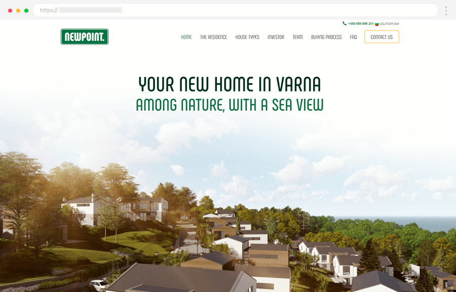
1. New Point: Clean and Modern Website with Complex Functionality
Newpoint is a project set by a professional team of architects and designers who wish to prove everyone living in the city can be much better. The website is powered by WordPress and presents the concept of living a modern life among nature in the suburban parts of the big city, showcasing the land, and types of houses and listing the direct practical benefits of purchasing a house.
Highlights:
- Clean modern design with a smooth parallax effect and custom graphic elements.
- Easy navigation
- Big detailed photos of the property
- The homepage packs the most important info about the project.
- Lists the direct benefits of living in the area and the related activities for residents.
- Lists the types of houses and their area, each with a slider of photos, blueprints, and details such as the area in m2, garage and parking options, number of floors, etc.
- Location via Google Maps and a complex map; an embedded Google Map; listed directions.
- Offers a phone number, physical address of the agency, and email address.
- Info about the investor and the team behind the project, as well as social proof and portfolios
- Detailed information about pricing and the buying process
- Bilingual website (both ENG and BG copies are written by an actual copywriter)
On the downside, although the website works perfectly on mobile, the desktop version offers a much better and more interactive presentation of the houses.
- Live Website: New Point
- Designed/ Developed by: htmlBurger
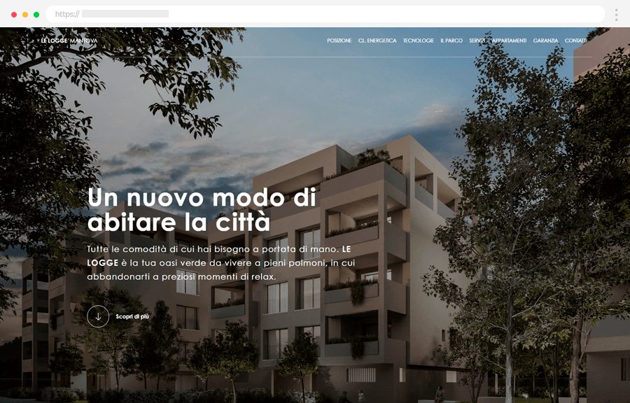
2. Le Logge Mantova: A Single-Page Experience
Le Logge Mantova is a new modern residential area in Mantova, northern Italy. Built on Gatsby, the single-page website offers a smooth scrolling experience with transitions and parallaxes, surgically-selected content, and a downloadable brochure.
Highlights:
- Clean and modern design with a smooth parallax effect.
- Easy navigation with anchor links
- Big detailed photos
- A one-page experience.
- Detailed info about the area and its benefits, with accurate photos
- Info about the services and apartments.
- Explains the warranty
- Lists the technologies involved and the benefits of each
- Offers a phone number, physical address of the agency, and email address.
- Custom icons.
On the downside, the website doesn’t include a functional embedded Google Map, instead, it uses a static photo of a map. However, it gives a list of places of interest and the exact distance from the property.
- Live Website: Le Logge Mantova
- Designed/ Developed by: Web Heroes (Italy)
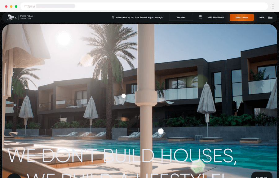
3. Polo Signature: Interactive Street View Map During the Daty and at Night
Polo Villas quarter in Batumi, Georgia, consists of 51 two-level townhouses away from the city. The promotional website is powered by WordPress and sports really high-quality visuals, including immersive background videos and beautiful transitions to convey the right emotions and make visitors really “feel” the place.
Highlights:
- The website has background videos, transitions, and complex hover effects, and still manages to load fast and load properly.
- Clean code, all made from scratch, while WordPress only serves as means for the real estate agency to manage the content.
- Sticky navigation with essential links such as location, webcam, contacts, and the navigation icon.
- Mobile first: the mobile version looks even better than the desktop one. Including custom navigation icons specifically made for the mobile version only.
- Quick loading screen with the brand logo.
- Offers a complex gallery, including a video gallery
- Offers info about the project developer and the technologies.
- Infrastructure: the direct benefits of living in the area and the related activities for residents. Embedded Google Map for the area with pinned locations to explore.
- Social proof and social media links
- Valuable info such as terms of payment, related documents, and construction progress.
- Interactive map of the properties with a tutorial. Users can walk around the area, click on different properties and view detailed information about each.
- Users can choose to view the interactive map in a day or night mode.
- The option to add houses to Favorite for later reviewing.
- Bilingual website (both ENG and RU copies are written by an actual copywriter)
On the downside, the written content with lower priority is set to a grey color that blends with the dark background and might be harder to read for some users.
- Live Website: Polo Signature
- Designed/ Developed by: Smarto Agency (Ukraine)
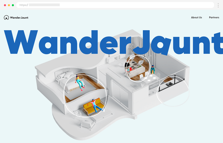
4. WanderJaunt: Story-Telling with Custom 3D Animations
WanderJaunt offers a new take on property management as a perfect counter to Airbnb. Here we have an interactive 3D website and story-telling, that engages and excites. Built with NuxtJS, the website has 3 pages: a homepage that packs the entire presentation all the way down to the contact form; an About Us page; and a Partners page.
Highlights:
- Complex 3D graphics, all interactive on scroll
- Clean code, all made from scratch
- Custom 3D models and graphics
- Well-written copy
- Quick loading screen
- Offers info about the project developer and partners
- Social proof and social media links
- Contact form and contact info, including a phone number.
- Client testimonials section
This is a very exciting experimental design, however, it lacks some of the most important pieces of content users will be looking for. This includes a gallery of the properties, important info such as terms of payment, and other legal processes. On the downside, the website might need some more optimization for mobile, as it currently lags on some devices, and pieces of the content may overlap improperly.
- Live Website: Wanderjaunt
- Designed/ Developed by: Thoughtlab (USA)
5. Unit Innovation City: Unique Proposition
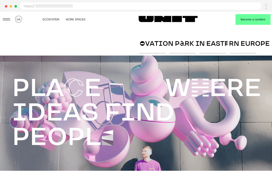
UNIT.City is a prototype of the city of the future and the largest innovation park in Eastern Europe. This project presents an entire ecosystem for students, startups, and corporations, based on the idea of creating an urban space that is productive and pleasant at the same time. So let’s look at the project’s official website.
Highlights:
- Unique proposition and concept
- Fast-loading website
- Detailed presentation with plans and accurate photos
- Video presentation
- Integrated blog with related articles
- A list of companies working on the project with website links and portfolios
- City bus schedule
- UNIT App
- A list of phone numbers related to different types of inquiries
- Social handles and social proof
- An embedded Google Map with the city location
- Sticky navigation with essential links
- Bilingual website (both ENG and UA copies are written by an actual copywriter)
The website also features a full list of what’s included in the price for renting an office, an apartment, or a place for an event. On the downside, the website is also content-heavy and some users might easily get lost while searching for something specific.
- Live Website: Unit: Innovation City
- Designed/ Developed by: Twid Creative Studio (Ukraine)
6. Kobu: Hand-Picked Locations and Properties
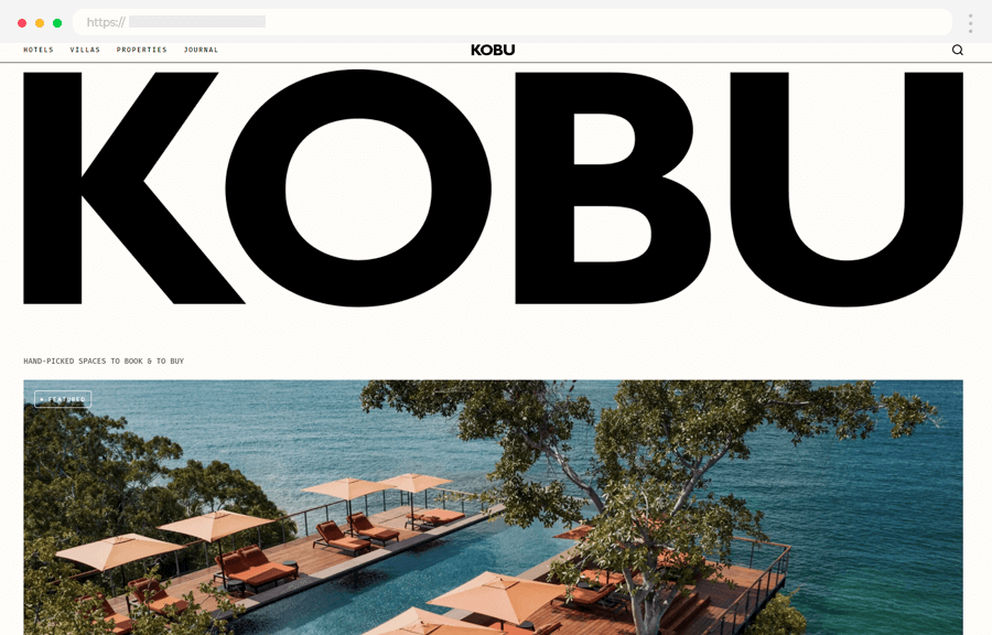
KOBU is a global resource of handpicked hotels and properties. Its website serves for booking designer properties in exotic destinations. In terms of experience, users can enjoy a beautifully-designed full-screen website powered by Elementor WordPress. Clean design, big photos, and a full portfolio of places to book and buy.
Highlights:
- The website serves as a portal for users to book hotels or buy real estate
- Niche proposition: hand-picked luxurious properties in exotic places
- Fast-loading website
- The homepage features the newest locations and offers links to view the entire portfolio
- Featured destinations and properties
- An embedded Google Map with the city location
- Sticky navigation with essential links
- Integrated search for users to find properties based on the desired destination, type of landscape, and popularity; or simply search by hotel name.
- Integrated journal (blog) with presentations of different featured locations and related activities, landmarks, etc.
On the downside, the website doesn’t have an integrated booking functionality, but rather uses an external application for the booking process. This is also the case with contacting the agency, users will be redirected to an external page.
- Live Website: Kobu
- Designed/ Developed by: Marc Personick (USA)
7. Hanging Miracle Gardens: Single-Page Story
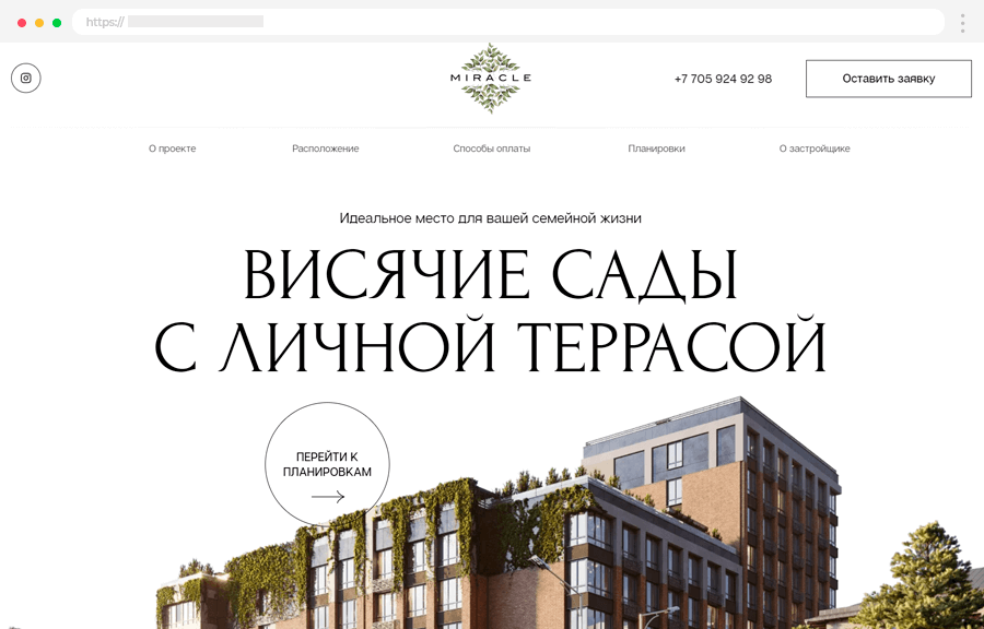
MIRACLE consists of an area with 5 houses, a 6-story building with modern terraces, and a 10-story building in urban hi-tech style with a private terrace. Unlike most projects promoting new buildings that escape the city life, here the agency embraces it to make city life a little better. With an already untypical message, the full-screen single-page website has a strong start. Powered by the Tilda website builder, it offers users smooth animations and transitions on scroll, overlay elements, and an interesting story to tell.
Highlights:
- The website uses storytelling to present its proposition
- Perfectly optimized for mobile, including the animations and transitions
- Fast-loading website, clean code, uses WordPress only as means for the agency to manage content
- Big detailed photos of the property
- Fun little mysteries: there are question mark icons for users to click and discover facts about the buildings, technologies used and etc.
- An embedded Google Map
- Sticky navigation with essential links
- Info about the payment methods
- Info about the developer, as well as their portfolio of completed projects.
- Comprehensive floor plans, info about mortgage, or full payment with discount options.
- Video presentation
- Offers a phone number, physical address of the agency, work hours, and social proof.
On the downside, single-page websites can be a pain if they’re too heavy on content. The experience feels like an infinite scroll and might be difficult for some users to go back to a piece of content they need. Using modals for more detailed parts of the info of each section would be a nice solution; in case separating the content into multiple pages would break the story.
- Live Website: Hanging Miracle Gardens
- Designed/ Developed by: Kaizen Agency (Kazakhstan)
8. Base 3 Real Estate
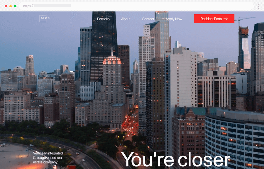
Base 3 is an urban development real estate company in Chicago. Their portfolio website is powered by WordPress and offers a minimal fullscreen experience. What we found interesting about this portfolio is the homepage and its minimum amount of elements. Most portfolio websites pack their projects, expertise, contacts, and CTAs all in one place.
Here, however, the designer’s decision was to send all the info into separate pages and create a homepage out of a title, subtitle, and background video with Chicago in all its glory. Users can get into the mood of what it would be like living in Chicago, and then simply click on the navigation icon and choose which parts of the portfolio they’d like to explore.
Highlights:
- A modern and very minimalistic design
- Well-optimized background video with good quality that doesn’t mess with the loading time
- Clean homepage with just a title, subtitle, and background video.
- Perfectly optimized for mobile
- Fast-loading website
- The portfolio includes curated projects and each project has a separate page in full detail and a featured gallery.
- Sticky navigation with essential links
- Offers a phone number, the physical address of the agency, and a contact form.
- Includes an online portal for management
- Listings for available apartments users can apply for
In terms of the listings, if users need to view details about the available properties or apply to rent, they will be redirected to the Base 3 Development app page with all the necessary info.
- Live Website: Base 3 Real Estate
- Designed/ Developed by: Efir Media (USA)
9. Insitom.com
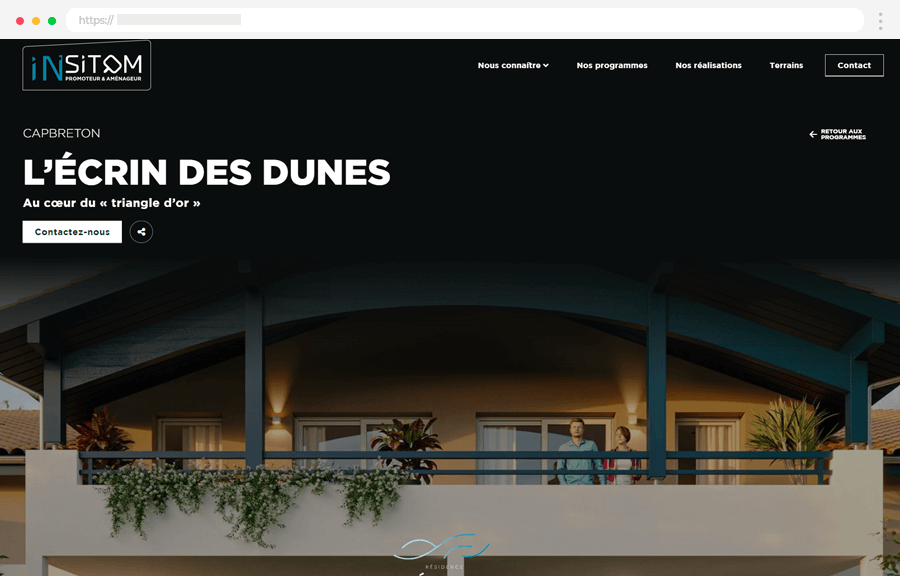
- Live Website: Insitom.com
10. Dager.bg
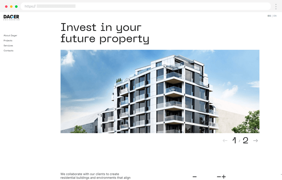
- Live Website: Dager.bg
11. Crest Estate Landing
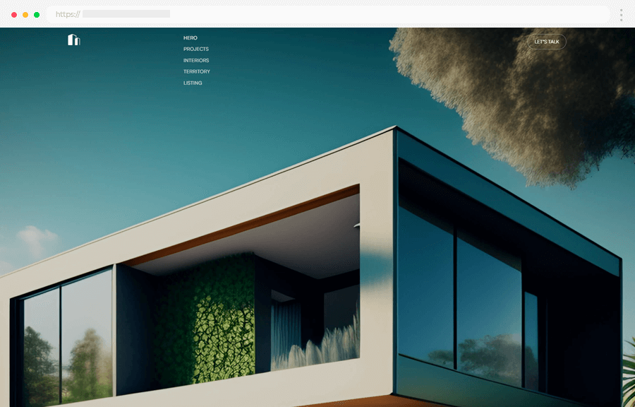
- Live Website: Crest Estate Landing
12. Varino.pt
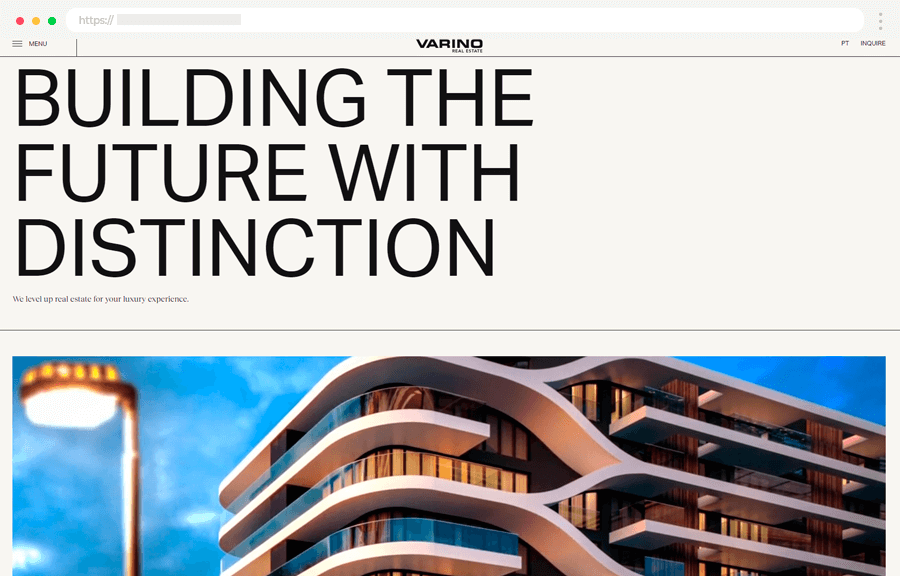
- Live Website: Varino.pt
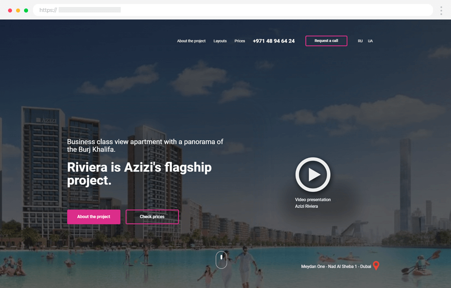
13. AllDubai.Capital
- Live Website: AllDubai.Capital
Key Takeaways
To sum up, a real estate website designing task is not like designing any other eCommerce website, as booking, renting, or buying properties is a complex process that needs to feel safe, secure, and comfortable for both the client and the agency. So, what makes those 10 real estate websites so successful in their design? Let’s see what we’ve learned from them.
🔑 Fast loading times
Optimizing your content should be a priority, especially for data-heavy real estate websites. If you use a lot of animations and transitions that need time to load properly, you can opt for a loading screen, however, this one should also load relatively quickly.
🔑 Detailed property listing
If your website offers a variety of properties for rent and purchase, make sure to put all the information users need: number of rooms, bedrooms, and bathrooms; terrace; square footage; all systems included (heating, electrical, water); floor covering; common areas; appliances; remodeling opportunities; parking options; important areas close to the property. etc.
🔑 An integrated Google Map
Nothing speaks legitimacy like showing your property is a real place on Google Maps. Users can interact with the embedded map and also learn what stores, businesses, schools, and other important places are scattered around the property.
🔑 High-resolution property images
Include high-quality detailed photographs of the property to help users visualize what it will be like loving or working there.
🔑 Internal search
Integrate an accurate search functionality for users to easily find what they’re looking for.
🔑 Easily accessible and full contact info
Make your contacts easy to access. Users tend to trust agencies with displayed phone numbers, physical addresses, and working hours more than those who only feature a Gmail and a contact form. Allow visitors to check your legitimacy and to feel safe with their choice.
🔑 Intuitive user experience
Especially for real estate websites, content architecture is crucial. Use your homepage to exhibit what your website has to offer, but pack the details on separate pages or modals. If the homepage feels like an infinite scroll, it may confuse users and make it hard for them to go back to a particular piece of info they need.
In addition, use sticky navigation so users can locate essential links at all times. With intuitive user navigation and a simple menu, your visitors will be comfortable going through your web page.
🔑 Mobile-first
The mobile-first approach will boost your search engine rankings by improving visibility, so try designing your website specifically for mobile and then adapt it for desktop. If you already have a website that is responsive; try improving the optimization for mobile. Most people use mobile devices to check out everything so you need to make your website easily accessible by segmenting mobile search, visitor flow, and form data.
We hope you packed a lot of great ideas for your next real estate website design project. In the meantime, why not check some of the related articles: