Design, UI, UX, Inspiration, Website Examples
21 High-Converting Landing Page Examples To Learn From in 2025
Landing pages are an essential part of your digital marketing strategy
-
- May 19th, 2022

One thing you could do to drastically improve your ROI is to use landing pages to convert new leads. When done right, direct traffic to your landing page can help you convert way more leads than the traffic to your homepage. In this article, we will explain how this happens and, of course, break down some excellent live landing page examples proven to convert in 2025.
We’ll take a look at 21 inspirational landing page examples that follow the best practices, boost engagement, and make visitors eager to hit the CTA button.
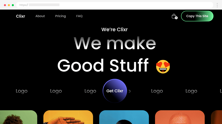
1. Clixr eCommerce
Clixr is a Webflow template, and its landing page impresses with beautiful, colorful images, minimal design, and minimum text, that explains everything most thoroughly. Its animated taglines and scrolling image gallery in the hero section instantly engage visitors. The About section explains its benefits clearly, showcasing multiple project previews. Strategic CTAs prompt action at every turn.
Highlights:
- Strategic CTAs under each section to prompt user interaction.
- Reviews integration
- Highlights pricing tiers and dummy sections, demonstrating template versatility.
- Guides users through sections with scroll-triggered animations.
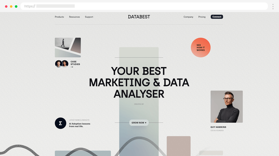
2. DataBest
Using a lot of animations and transitions, designed with a clean minimalist design, DataBest’s landing page manages to hold visitors attention till the end.
Visitors effortlessly explore sections, mirroring the site’s quick transactions. Halo Lab’s coding brings this interactive experience to life, ensuring a fun and informative visit.
Highlights:
- Engaging animations that capture the attention
- Effortless navigation with swift transitions
- Clean design yet visually appealing, keeping visitors intrigued.
- A subtle color palette that complements content without distractions.
- Reliable information delivery
- Focus on substance that demonstrates DataBest’s commitment to reliability.
- Interactive browsing experience.
3. Meadlight: Smooth Scroll-Animation Product Presentation
Visuals matter and Meadlight knows it! This landing page promotes a single fermented honey drink product by making it part of the design. In addition, the actual bottle gets cool animations and accompanies you through your scrolling experience.
Highlights:
- Promotes a single product, which allows the copy to be completely focused on one thing.
- Short sections, that explain the benefits, ingredients, and recipes.
- Animated product element that accompanies you while you scroll.
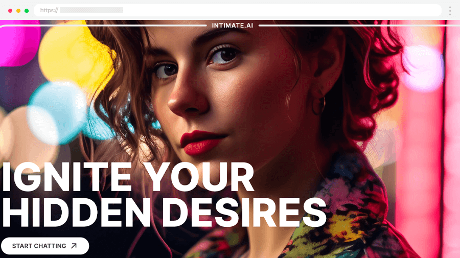
4. IntimateContest
It’s hard to explain a completely new service nobody knows about, and the authors of this website executed it perfectly! They grab the attention with high-res colorful images, simple explanations, examples, and reasons why should you be interested.
The site optimizes user experience with lazy loading, ensuring smooth loading of content without interruptions. The hero section features kinetic typography alongside an attention-grabbing AI product image and a compelling call to action.
Highlights:
- Clear, concise descriptions of the service’s value.
- Persuades visitors on why they should engage.
- Lazy loading optimizes element loading without disruption.
- Kinetic typography
- Mixed horizontal and vertical scrolling experience
- High-quality AI visuals
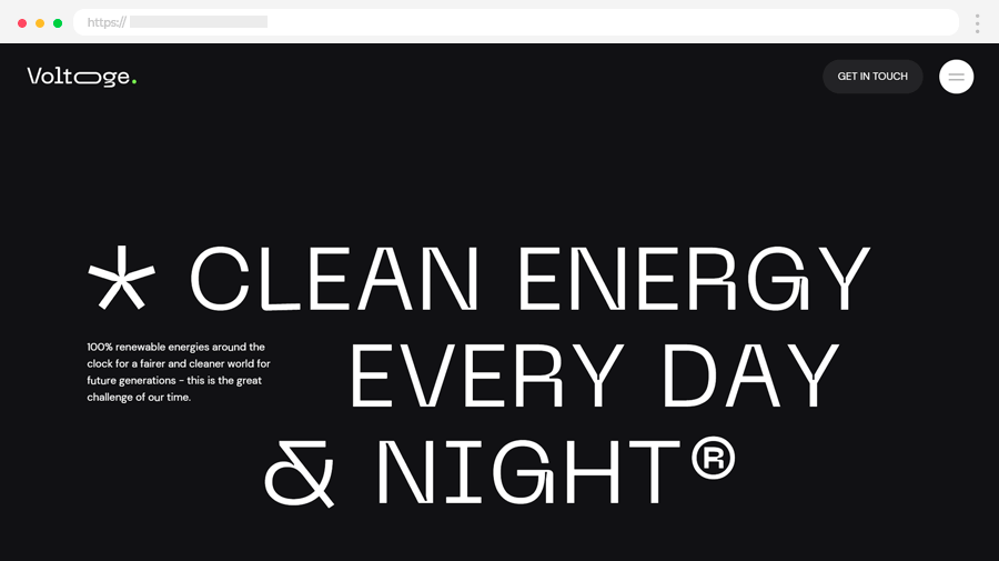
5. Handmade Company – Voltoge
Another interesting approach to a landing page is to grab the attention with minimal distraction- Voltoge by Handmade Company takes a bold and minimalistic approach to its landing page, using a striking black and white theme to immediately capture attention.
The page boasts a black neo-brutalist design with oversized typography that commands focus. The hero section features a compelling message against a black backdrop, emphasizing the goal of “Clean energy every day and night,” accompanied by a concise description.
Highlights:
- Bold black-and-white theme
- Focused hero section: Emphasizes the core message with simplicity.
- Action-oriented content that details the foundation’s action plan for clean energy.
- Minimalist map presentation that shows the project infrastructure.
- Includes recent news and additional information for visitors.
6. The Fabulous Page
Another great example of a landing page with unique 3D parallax effects that make you scroll till the end. The Cartier shows how creativity can be used to present your products with this landing, instead of just a listing page.
As users scroll, they encounter a heartfelt message from the designer and a catalog listing all discovered items. The page lacks a direct buying option, directing users to an external site for purchases.
Highlights:
- Engaging 3D effects through the interactive journey.
- Creative product showcase
- Interactive item display of collection items floating in clouds, encouraging exploration.
- Immersive animation changes scenery with accompanying sound for engagement.
- Comprehensive item catalog that lists all discovered items for easy reference.
7. Smalls
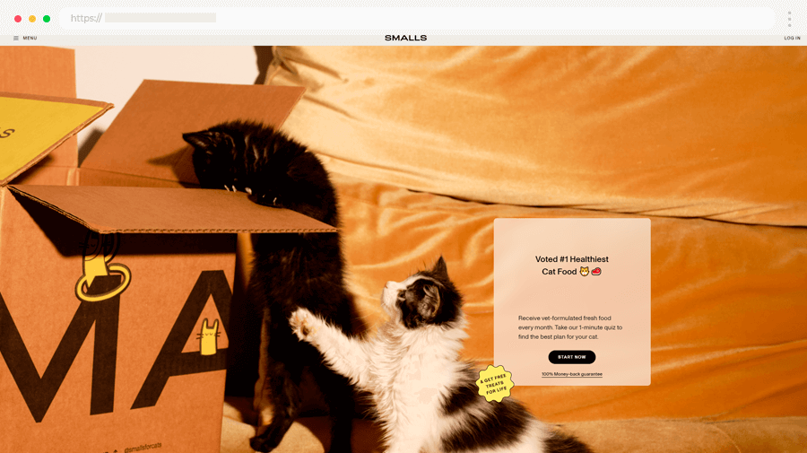
Smalls is a website for cat food, which uses a quiz to find the right food for your pet. It focuses on reviews and mentions from big media and provides useful stats from its clients. They perfectly use the people’s opinions to convince new potential clients that their product is worth it. Also, making a quiz before purchasing is another great approach that makes people take action and build connections without making a purchase.
Additionally, a modal window offers free shipping on the first order, enhancing the personalized experience.
Highlights:
- Personalized quiz
- Emphasis on reviews, including media mentions and client feedback.
- Engagement without purchase which establishes connections through a quiz before buying.
- Free shipping on first order offer
8. Future London Academy Branding
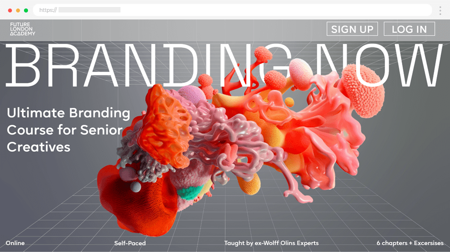
Especially when you are doing a landing page related to branding, design, and marketing, it should be a top-notch experience to show off your skills – and this is exactly what Future London Academy did. An innovative, super fresh, and memorable design that screams professionalism.
With a bold assertion as the ultimate branding course for senior creatives, they feature AI art that sparks immediate conversation. The page’s structure is immaculate, providing comprehensive course details—target audience, duration, certification, and pricing. Following sections offer compelling reviews from past participants, an overview of course content and skills acquired, and introductions to industry-leading curators with impressive credentials.
Highlights:
- Reflects professionalism and skill in branding, design, and marketing.
- Bold positioning declares itself as the ultimate course for senior creatives, drawing attention.
- Detailed course information
- Compelling reviews.
- Industry-leading curators
9. ION X1 Conceptual Product Futuristic Landing Page
Similar to the previous example, lusion creates unique landing pages for its concepts. In this case, we discuss a creative company that builds real-time graphics for agencies and studios. To showcase their skills, the company has built a real-time WebGL experience landing page for ION/X1.
Highlights:
- Stand-alone landing page with a unique URL.
- A conceptual product that aims to showcase the company’s creativity and skills rather than the product itself. The page serves as a sample.
- Impressive modern design.
- Full-screen interactive experience; progress bar.
- High-quality CGI.
10. OtterDev
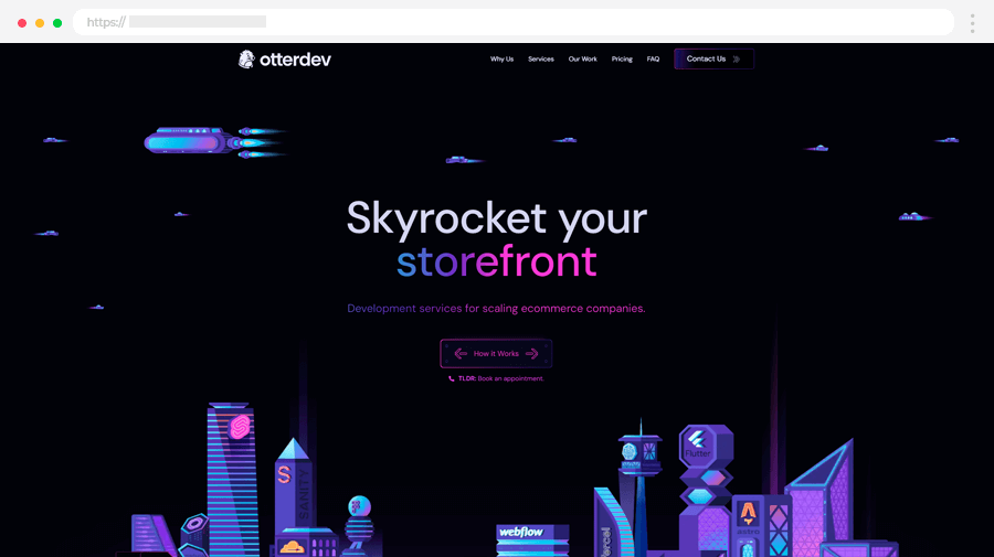
This wonderful design example shows how a home page can be turned into a great landing page. Of course, this cannot be implemented in every website, but for startups and service providers, or every other case when mostly new visitors come to your site, it can work efficiently. This example by OtterDev uses a dark color scheme with neon colors to give that futuristic, high-tech vibe.
Highlights:
- Demonstrates transforming a homepage into an effective landing page.
- A dark color scheme with neon accents for a futuristic, high-tech ambiance.
11. Three Dimensions
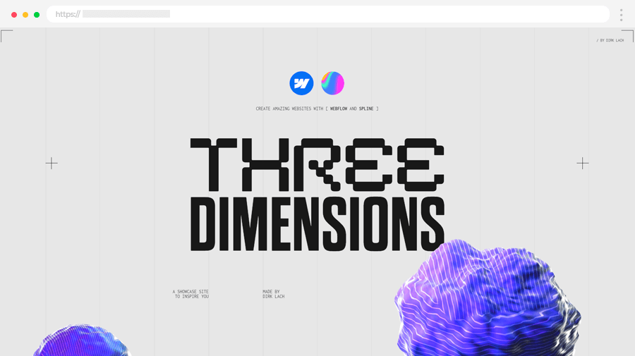
Another outstanding example of a landing webpage about 3D incorporates it perfectly to make an impression and explain a new tool in the best way possible.
Highlights:
- Showcases a new tool effectively through immersive 3D incorporation.
- High-quality CGI graphics
- Scrolling Animations and parallax effects
- Mixed horizontal and vertical scrolling
- Progress bar with chapter navigation for easy overview of content.
12. Lusion
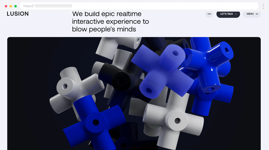
This studio promotes itself as bringing ideas to life through visually captivating designs – and they demonstrate it unbelievably well on their landing page! When you open this page there are plenty of things to like – the smooth non-stop animations, mouse reactions, and more, everything combined seamlessly to impress.
Highlights:
- Smooth animations throughout the landing page
- Engaging responses to user mouse movements
- Impressive visual elements enhance the page’s appeal
- Scroll-triggered animations
13. Apple iPods Max Landing Page
AirPods Max is an inner detailed product landing page from Apple’s official website. As expected from a company such as Apple, the product presentation captures attention with modern high-tech design with huge fonts, micro-animations, and high-quality detailed product images.
Highlights:
- Modern high-tech design, suitable for Apple.
- High-quality product presentation images
- Comparison table where the user can compare AirPods Max to other similar products.
- Detailed product description, manual, test results, and features.
- No distractions.
- Impeccable code and smooth animations.
14. Creative Leadership Courses Landing Page
Future London Academy creates design events and short courses in London. They often build standalone landing pages or microsites as a supplement to their main website to promote different events and courses. In this case, the academy launched the creative Leadership landing page to promote an online course for motivated managers and leaders.
Highlights:
- Stand-alone landing page with a unique URL.
- Each landing page by Future London Academy that promotes courses follows a similar dark mode geometric design with art deco elements, which makes the brand recognizable.
- Well-structured, with a clean website design and high contrast.
- FAQ section.
- The CTA is present in almost every section.
15. Online Brand Style Guide Kit Landing Page
This landing page with a few snazzy hover-sensitive elements serves to promote a Style Kit collab between Corebook and The Futur. Both brands already have popularity and recognition amongst web designers and web developers and their collaboration translates into bringing Futur’s best-selling branding template into Corebook to reimagine how branding teams use style guides.
Highlights:
- A partnership between two brands.
- Simple and clean design that manages to fit detailed product descriptions and demos.
- Rich in visuals: high-quality images, animated screenshots, and videos.
- Solid social proof: agencies that use the product as well as their clients.
- Full description of the benefits.
- No distractions.
16. Wookmama Color Visualizer Mobile App Presentation
Here we have a landing page that promotes the Wookmama Color visualizer mobile app. Its main purpose is to convince users the product makes it easy for designers to select the right color palettes for logos, websites, packaging, textiles, and interiors.
Highlights:
- A niche product, from designers for designers.
- Clean, minimalistic design.
- The landing page changes color schemes on the scroll.
- Demo screenshots.
- The “Free download on the App Store” CTA button is sticky, and accessible at any time while you scroll.
17. SAMINA Sound Light Sleepsystem Product Landing Page
Another great product presentation to inspire your eCommerce projects comes from SAMINA Sound Light System. It features real-time scrolling photographs, awesome user interactions, and a clean design.
Highlights:
- Promotes a single product which gives the landing page more focus.
- Advanced JS animations and real-time scrolling product animations.
- Read more options for sections open a pop-up.
- Screenshots, that demonstrate how the product works.
- The CTA button is sticky and accessible at all times.
- Google Play and App Sture buttons to download the app.
18. GWENT Price of Power Expansion Pass Landing Page
CD Project Red is a popular game development company, famous for The Witcher, GWENT, and Cyberpunk 2077 with an equally strong design game for their websites and landing pages. Their newest GWENT card game expansion gets a beautiful inner landing page with high-quality artwork by famous digital artists, an interactive experience, and a beautiful design.
Highlights:
- Custom artwork by famous digital artists.
- Full expansion description, well-structured.
- The CTA button is present in almost every section.
- FAQ section.
- Recognizable brand design, related to the company’s most popular game.
19. Trendspotting Innovation Strategy Course Landing Page
Looks familiar, doesn’t it? Future London Academy gets another feature in this collection with another landing page promoting a course. As we mentioned in the Leadership course example, the company uses a specific design for all its landing pages to establish consistency and reinforce its brand. This example, although using a different accent color, shares the same style guide as the previous one.
Highlights:
- A consistent and recognizable style reinforces the brand: dark mode geometric design with art deco elements.
- Stand-alone landing page with a unique URL.
- Well-structured, with clean design and high contrast.
- FAQ section.
- The CTA is present in almost every section.
20. Airbnb Home Hosting Landing Page
Here we have a typical example of an explainer landing page. Airbnb uses a long well-structured page to educate visitors about their house hosting services.
Highlights:
- Features a convincing copy of purposes, benefits, features, and the mission.
- Already a trusted company.
- Service calculator.
- Embedded Google Maps.
- The CTA button is sticky and accessible at all times.
21. Native Poppy: Flower Subscription Service Landing Page
Our last landing page example features a flower-subscription service presentation with a fresh colorful design and beautiful illustrations. The CTA opens a full-screen popup with subscription options.
Highlights:
- Memorable and consistent brand design.
- Custom watercolor illustrations.
- Clean design.
- The CTA is present in almost every section and opens a full-screen popup with subscription options.
What is a Landing Page?
When we speak about digital marketing, a landing page is a stand-alone web page specifically built for a marketing campaign. The user usually lands on that page after clicking on a link, received in an email, or via ads they see on social platforms and other places on the web that publish ads.
While typical web pages include many links to encourage further exploration, landing pages have a single focus on their campaign goal, known as CTA (call to action). This type of structure with a single focus and no distractions increases conversions as there are fewer to no options for users to click away from the CTA. Most landing pages usually hide the main menu, the footer, the sidebar, and any other element, except the ones related to the campaign goal.
For example, let’s compare Shopify’s Free Trial landing page to Shopify’s homepage. The short landing page focuses entirely on the free trial option, listing the benefits, and a related FAQ section, while the only two clickable options lead to the campaign goal. On the other hand, Shopify’s homepage is long, content-heavy, and features different sections for a huge palette of services, options, stories, and everything that would encourage users to keep exploring. The cropped version in this screenshot alone shows 10 different links unrelated to each other.
Types of Landing Pages
We can categorize landing pages in terms of type and terms of marketing goals. The first category depends on how they’re related to your website.
- Standalone landing pages: Standalone web pages are distinct from your main website. Since they are usually designed with a specific goal, they lack main menu links, footer, and any other element on your other pages.
- Internal pages: Some product detail pages can be considered landing pages. However, they usually contain main menus and footers.
- Micro-websites: On rare occasions, some campaigns require multiple pages. When this happens, businesses usually create a mini-site with a different domain that supplements the main site.
In terms of marketing objectives, landing pages also vary in type:
- Lead-generating: They aim to convert target visitors into clients by collecting personal data such as name, email, occupation, etc.
- Click-through: They inform about offers, discounts, and other promotions that seek to convince users to take action right away.
- Explainers: The long well-structured landing pages that educate visitors. These usually feature a convincing copy of purposes, benefits, features, missions, etc.
This landing page by Zulke promotes a Data-driven Companies Survey you can download. It’s a lead-generating landing page in terms of objective, as it aims to collect visitors’ emails in exchange for valuable free content.
Why are Landing Pages Important?
Aside from increasing conversion rates, improving paid ad campaigns, and getting valuable insights from visitors, landing pages can also boost your credibility. If you plan your landing page to show your audience the benefits of your solution and social proof, they will see the value of what you’re offering.
Even if your visitors don’t convert right away, this doesn’t mean your landing page isn’t successful. If you have a strong brand identity with a clear consistent design and tone, and an interesting offer, your visitors will remember you in the future. Next time they land on your campaigns, your brand will be familiar to them and they will be more likely to respond.
Because they help convert leads into customers, landing pages are an essential part of your digital marketing strategy. Now, let’s see some excellent landing page examples that make users take action.
In Conclusion
To sum it up, landing pages have high commercial intent and are aimed at the conversion of a predetermined action. Unlike homepages, they are strictly focused on one objective and limited in navigation options. This is why, the best way to plan your next landing page design, is to ask the following questions:
- How will you drive visitors to your landing page?
- What kind of audience will visit it?
- What action do you want your visitors to take?
- Does your landing page deliver on its promise?
We hope you feel inspired by these 21 high-converting landing page examples in 2025 and feel ready to get those leads with your next project.
In the meantime, why not get some more web design inspiration or insights by visiting some of the related articles:
- 18 Examples of Successful One Product Shopify Stores
- 14 Effective About Us Page Examples (with Best Practices)
- 14 Modern Contact Us Page Examples That Do It Right
FAQ about Landing Pages
1. What makes a landing page “high-converting”?
A high-converting landing page effectively persuades visitors to take the desired action. Key elements include a clear headline, compelling copy, strong visuals, a focused CTA, trust signals (like testimonials), and fast loading times.
2. How is a landing page different from a homepage?
A homepage serves as a general introduction to your website and may link to various sections. A landing page, however, is more focused and designed for a specific audience or campaign, with one primary goal or action in mind.
3. What are some common mistakes that lower landing page conversion rates?
Common mistakes include:
- Overloading the page with too much information.
- Weak or unclear CTAs.
- Slow loading times.
- Poor mobile optimization.
- Lack of trust signals like reviews or guarantees.
- Distracting design elements or too many navigation links.
5. Is mobile optimization important for landing pages?
Extremely important! With most web traffic coming from mobile devices, a landing page that isn’t mobile-friendly can lead to higher bounce rates and lower conversions.
6. How can I improve my landing page’s headline?
Use a headline that is clear, concise, and directly addresses the visitor’s pain point or goal. Focus on the benefits and value they’ll gain by engaging with your page.
7. What are trust signals, and why are they important?
Trust signals include elements like customer testimonials, reviews, security badges, and guarantees. They help build credibility and reassure visitors that your offer is reliable and worth their time or money.
8. How many CTAs should a landing page have?
Ideally, a landing page should have one primary CTA to avoid confusing visitors. However, you can repeat the same CTA in different formats or positions on the page for better visibility.
9. How can I test if my landing page is effective?
Use A/B testing to compare different versions of your landing page. Test elements like headlines, CTAs, images, and colors to see what resonates best with your audience. Tools like Google Optimize or Optimizely can help.
10. How long should a landing page be?
The length depends on your offer and audience. Short landing pages work well for simple, low-commitment actions, while longer pages are better for high-value or complex offers that require more explanation.
11. What tools can I use to create a landing page?
Popular tools include Unbounce, ClickFunnels, HubSpot, Leadpages, and Elementor (for WordPress). If you are using CMS like Shopify, Webflow, Big Cartel, Wix, etc., you can use your site theme to create a landing page or build one completely from scratch with some web development knowledge.
12. How often should I update my landing page?
Regular updates are essential to maintain relevance and optimize performance. Monitor analytics to identify areas for improvement and update the page as needed, especially if your offer or audience changes.